Color definitions
Achromatic Color: neutral color – black, gray or white.
Additive Colors: The colors of light.
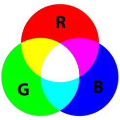
Additive primaries: The additive primary colors are red, green and blue (RGB). Primary colors cannot be created form other colors. Adding all three primaries in equal amounts produces white light. Adding the three colors in varying amounts produces all other colors. Adding two primary colors in equal amounts produces a subtractive primary.
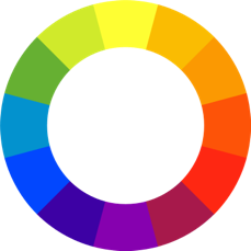
Analogous colors: Colors which are next to each other on the color wheel.
Brightness: Used in the HSB (hue, saturation, brightness) color model. Brightness is the degree to which a color appears to reflect light. The same as lightness.
Chroma: See Saturation.
Chromatic Color: All non-neutral colors, that is, all colors which are not black, gray or white. In the English language, the work “color” usually means a chromatic color.
CIE: International Commission on Illumination (Commission internationale de l’éclairage). The international organization which concerns itself with color and color management.
CMYK: Cyan, magenta, yellow, the primaries of subtractive colors, the colors of dyes and pigments, plus black. “K” is used for black to avoid confusion with blue. CMYK are the colors used in color printing.
Color: Color, in its more restricted usage, refers to the perception of what we see, based on how different wavelengths of light stimulate the color receptors in the retina of our eyes. Each color represents a specific wavelength of light in the visible spectrum.
Colorant: The medium used to produce a color. This can be ink, pigment, toner, dye or phosphors.
Color Temperature: Warm colors are red orange and yellow. Cool colors are green, blue and violet. To the eye, warm colors advance and cold colors recede.
Color Wheel: A circle with the all colors of the visible spectrum going around it in a continuum.
Complementary Colors: Colors which are opposite each other on a color wheel. When complementary colors are mixed together, they produce some shade of gray.
Contrast of cold – warm: One of Johannes Itten’s Contrasts of Color. The contrast in a composition due to the combination of warm and cool colors.
Complementary contrast: One of Johannes Itten’s Contrasts of Color. Contrast in a composition due to the combination of complementary colors.
Contrast of extension: One of Johannes Itten’s Contrasts of Color. The visual contrast that results from the amount of each color that is used in a composition.
Contrast of hue: One of Johannes Itten’s Contrasts of Color. The visual contrast that results from the difference between the colors combined. A combination of the hues red, yellow and blue is high. A combination of the hues red, red orange and orange is low.
Contrast of saturation: One of Johannes Itten’s Contrasts of Color. The visual contrast that results from the combination of colors with varying saturation.
Contrast of light-dark: One of Johannes Itten’s Contrasts of Color. The amount of contrast between the dark and light values in a composition.
Dye: A colorant which is soluble, unlike pigment, which is insoluble. Dyes can produce brighter colors than pigments, but also are less stable and tend to fade over time.
Hex triplet: A color notation system in which each color is identified by a 6-digit number. This color notation system is used in computer programs.
Hue: In its more restricted usage, the word hue refers to the pure colors, the six elements of the colors wheel, – red, orange, yellow, green, blue and violet. Derivations of those hues are usually designated by modifying adjectives, such as light green, pastel blue, etc. Each hue, and modification of a hue id defined by an RGB triplet.
Intensity: See Saturation.
Itten’s Seven Color Contrasts: Hue, Light-Dark; Cold-Warm; Complementary; Simultaneous; Saturation; Extension.
Light: The part of the electromagnetic spectrum which has a wavelength between 380 and 720, the part humans can see.
Lightness: The degree to which colors appear to reflect light. The same as brightness.
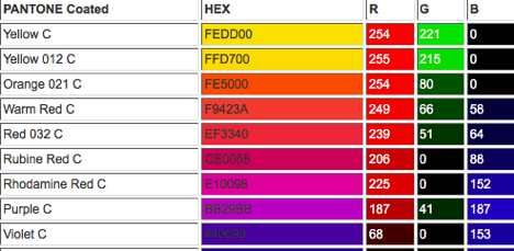
Pantone Colour Matching System: A standardized system to identify and reproduce colors. Each Pantone number has an equivalent Hex triplet and RGB code.
Pigment: A colorant which is insoluble. (Dyes are soluble.) Pigments tend to fade less and be more permanent than dyes.
Pixel: Tiny dots which contain red, green and blue information which produce a colored image on a monitor or scanner. They are like dots of ink on a piece of paper that has been printed with an image. The resolution of a monitor is expressed in terms of pixels per inch or ppi. A printer’s resolution is expressed in terms of dots per inch or dpi.
Primary Color: A color which has a single frequency and cannot be made by any combination of other colors. All non-primary colors can be made by combining the primary colors.
Primary colors of light (additive) are red, green and blue (RGB). Primary colors of pigments or dyes (subtractive) are cyan, magenta and yellow (CMY).
RGB: Red, Green, Blue. The primaries of additive colors, the colors of light.Each color is described by indicating how much red, green, and blue is included. The color is expressed as an RGB triplet (r,g,b), each component of which can vary from zero to a defined maximum value. If all the components are zero the result is black; if all are at their maximum, the result is the brightest representable white.
Saturation: Also called chroma, or intensity. The purity of a hue. The highest intensity or purity of a hue is the hue as it appears in the spectrum or on the color wheel. Tints, tones and shades are less saturated forms of a color, e.g. pink and maroon are less saturated than red.
Secondary Color: Those colors that are produced by combining the primary colors.
Shade: A hue that has be darkened from its most saturated form, e.g. maroon is a shade of red. Shades are achieved by mixing black with a pigment.
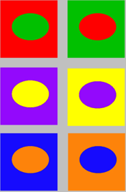
Simultaneous contrast of color: One of Johannes Itten’s Contrasts of Color. It is the change in appearance of a color resulting from its proximity to another color. Each color becomes tinged with the other color’s opposite.
Split complement: A color scheme that includes a color (A) and the two colors on either side of the complement of color A, e.g. green, red-orange and red-violet.
Subtractive Colors: The colors of dyes and pigments.
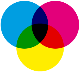
Subtractive Primaries: Cyan, magenta and yellow (CMY), the primary colors of pigments or dyes which create reflective colors. Primary colors cannot be created from other colors. Cyan absorbs (subtracts) red light and reflects blue and green. Magenta absorbs (subtracts) green light and reflects blue and red. Yellow absorbs blue light and reflects red and green.
Tint: A hue that has been lightened from its most saturated form, e.g. pink is a tint of red. Tints are achieved by mixing white with a pigment.
Tone: A tone of a hue is created in two ways: by adding a neutral gray; or by adding the color’s complement.
Triad: A color scheme that includes three colors evenly spaced around the color wheel, e.g. orange, violet and green.
Value: The relative lightness (or brightness) of a color.
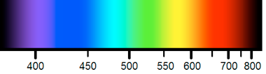
Visible Spectrum: The range of colors humans can see – those with wavelengths between 380 and 720 nanometers. The wavelengths in this range stimulate the cones (color receptors) in our retina. We see the shorter wavelengths as blue and violet. The longer wavelengths are seen as red and orange.