Click on images to enlarge.
Stendig Tapestries


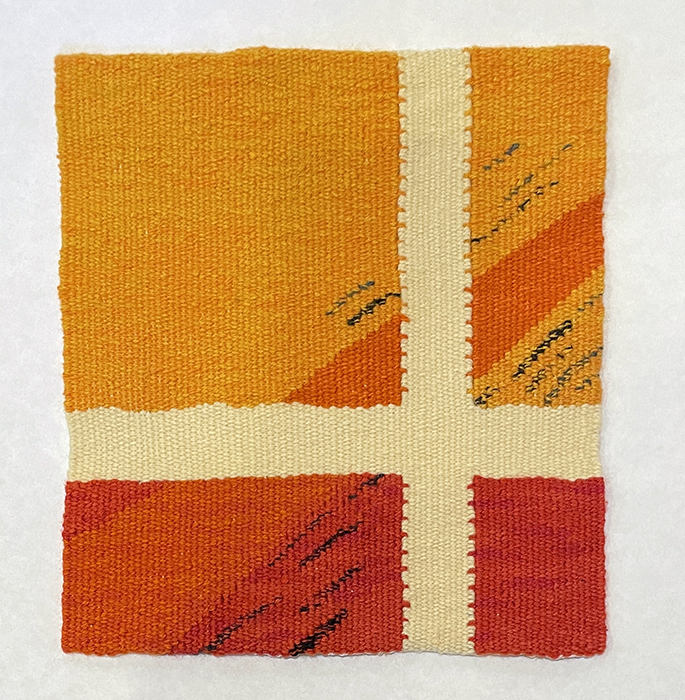
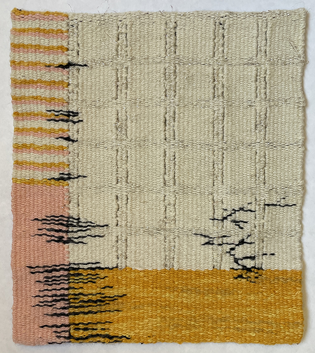
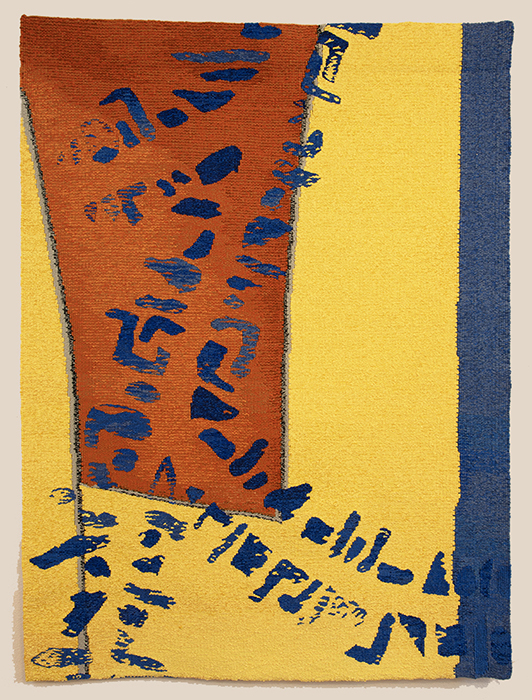
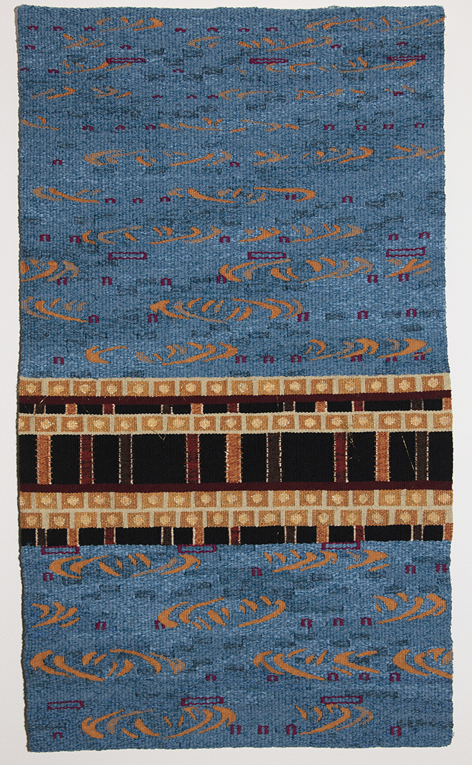
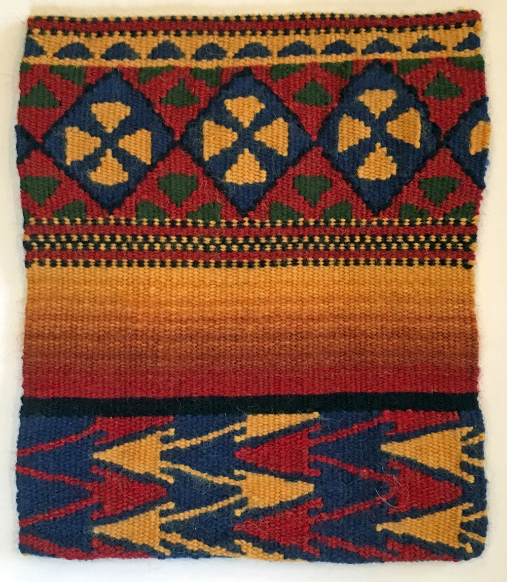
Stendig 2/9/16, 12″x8″ (left) Stendig 8/15/31, 12″x8″ (middle) Standing 0/21 (right)
The model for the Stendig tapestries is a collage which includes, among other things, numbers from the Stendig calendar. The Stendig Calendar was designed in 1966 by Massimo Vignelli and collected, that same year, by the Museum of Modern Art. The calendar and its typography are large and bold. Because of its popularity, the calendar has been produced continuously since its debut.
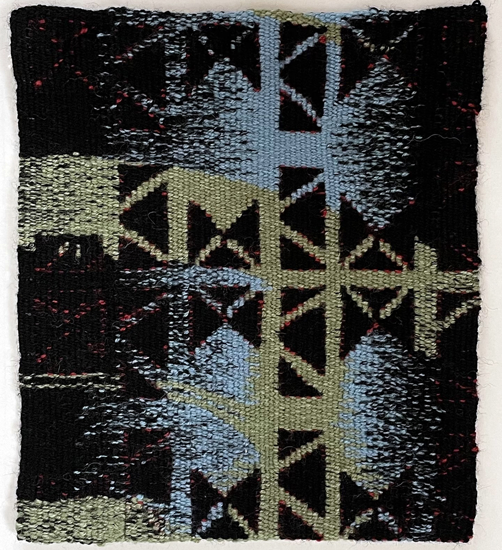
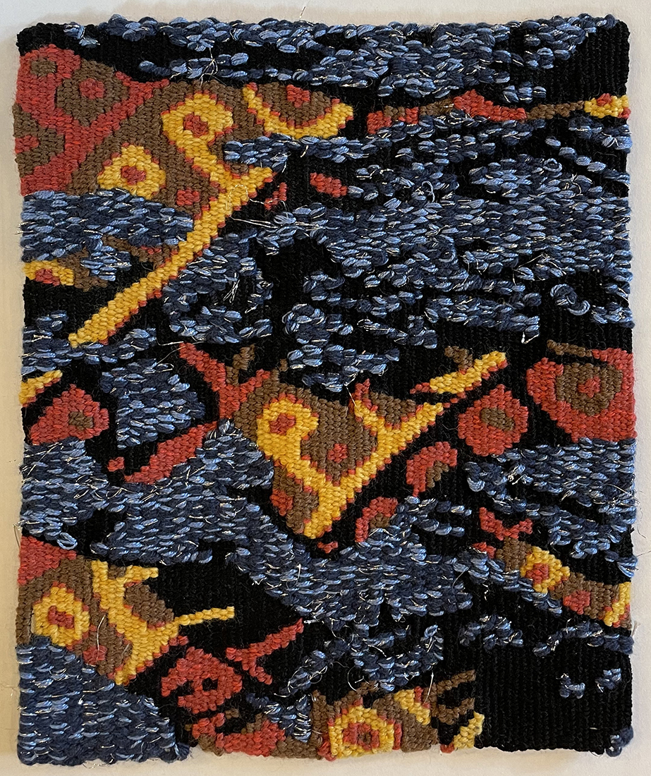
Borrowed Language Series


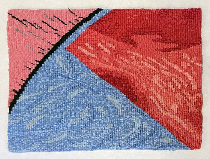
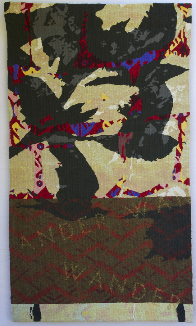
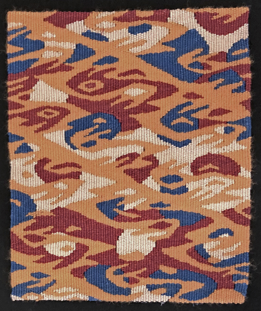
Borrowed Language 1, 11″x6″ (left) Borrowed Language 2, 11″x6″ (right)
My regional tapestry group launched a project in which we chose an existing textile as a springboard for a tapestry. These tapestries are part of that project. The source textiles are Andean. I excerpted motifs, altered them a bit and created my own composition. Because I saw the motifs and shapes as weaving language, I titled the pieces Borrowed Language.
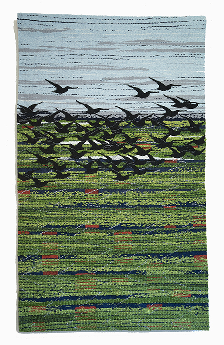
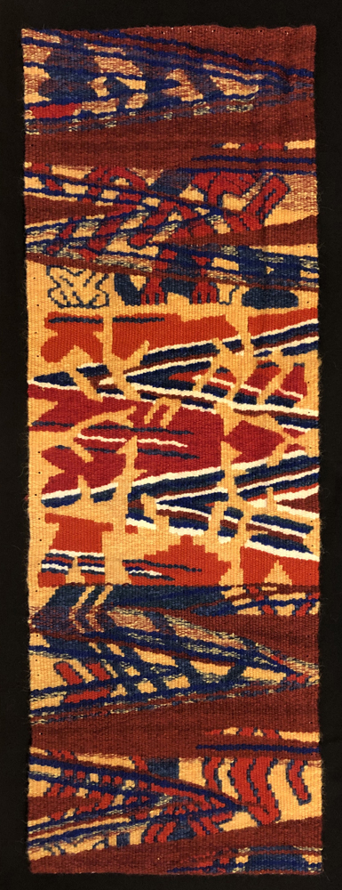
Larger Tapestries

The design for Camouflaged is a collage that was developed in Photoshop. The collaged components are a drawing of a flock of crows and an image of a garment that is repeated eight times, right side up and upside down, and in three different colors. The garment forms are transparent, revealing the underlying birds.
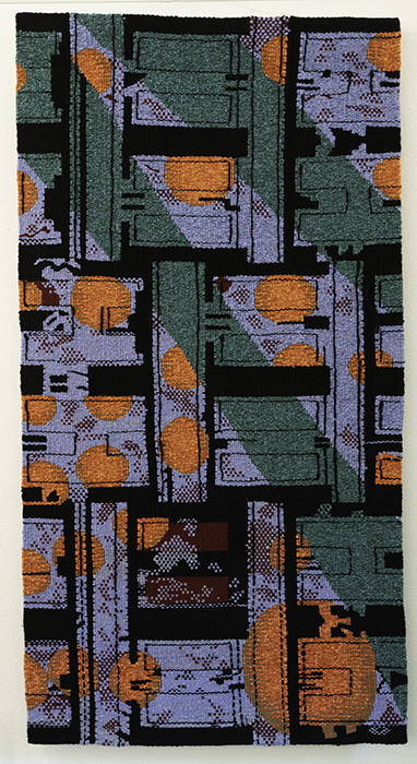
Lattice is a also a collage created in Photoshop. It combines geometric patterns and details from different textiles. The components bleed in and out of each other. The geometric grid in the tapestry references tapestry’s woven construction. By enlarging the grid, the structure is celebrated and caricatured. In addition, the grid serves as a background for a collage of details from textiles that intermingle over the surface. The textiles are, in turn, rendered, in part, through the half pass weaving technique, highlighting the pixelated nature of the woven grid.
Color Explorations
In 2022 I decided to take time to simply play with color. My goal was to think and work quickly – not the tapestry weaver’s usual modus operandi – so I turned to watercolor paints. I looked to both the natural and constructed world for inspiration. As the sketches accumulated, some of them spoke to me in a way that I thought warranted the time of weaving them into a tapestry. One piece led to another and they soon became the CS series.
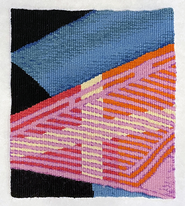
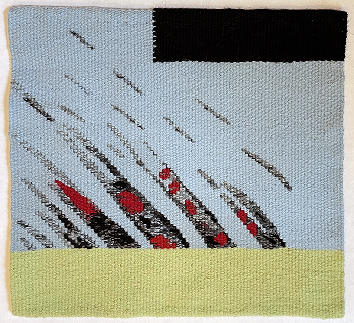

Rising/Falling is based on an image created by layering two different watercolors and letting them interact. One of the watercolors contains the larger blue, yellow and orange shapes. The other watercolor is the ascending, or perhaps, descending, forms that suggest some kind of alphabet. It appears as though a message is being transmitted but it is not legible. The letters are incomplete; the letters are dissolving into the background; the letters are impossible to comprehend. Why is it so hard to communicate?
Computer generated designs
In the fall of 2019, having just retired, I had a lot more time to be in my studio. I started experimenting a bit with woodling – doodling while weaving. I used my woodles to learn to weave patterns directly, by counting warp threads and weft passes. After the woodles, I began creating collaged, patterned designs in Photoshop. Most of the designs combine details from old textiles. My goal is to fuse the source material visually so that something new arises. The imagery from the source material is usually recognizable, but not necessarily obvious.
Swift, 50” x 30.5”
Swift, whose design was created in Photoshop, exhibits a visual strategy I employ frequently – building an image or composition from a small group of shapes that are repeated in order to suggest something that they, in and of themselves, are not. The source images I collage are often details from textiles. I repeat them over and over, sometimes altering their shape or scale or changing their orientation, in order to create the idea that is in my mind. The process is fairly organic. I usually do not have a specific image in mind that I am trying to recreate through this process. More commonly, I have a general idea and I cull details from textiles that work together in service of my idea. For Swift, my goal was an abstracted landscape with a dense flock of birds in flight.
The design for Drift includes details from historic textiles. Some components I chose for their color, others for their shape. As I composed the design, the blue background with the gold motif became water. Water sometimes seems so abundant, as when one visits the ocean. Other times it is scarce, creating tensions between the various stakeholders. In scarcity, difficult decisions impact the lives of the entire biome. The middle section is a break, a pause in the progression of the water. The abstract patterns offer the opportunity for absorption and reflection.
Read about the design for Drift here.
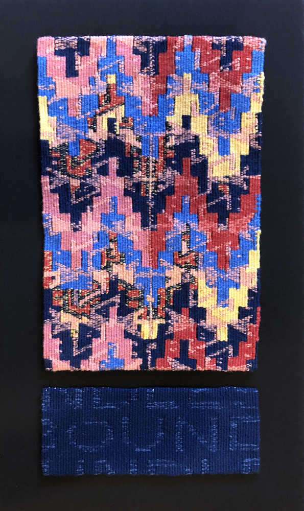
I have always been drawn to historical tapestries. Recent work references historical textiles more directly through the incorporation of borrowed patterns, motifs and/or details. The excerpts are combined with each other, and with other image sources, such as drawings or photographs, to produce a layered image in which the different components are merged together into one blended image. Boundless consists of two separate tapestries mounted together. The source images for the upper tapestry are a stepped triangle pattern from a Nazca discontinuous warp and weft fabric and a double headed serpent motif from an Andean double weave. I layered and fused the images in Photoshop. The bottom tapestry is text dissolving into the background. The word, which is also the title of the tapestry, offers an opportunity to reflect upon the suggestive and absorbing nature of repeated patterning.

Woodle 1, 9″ x 9″
AWW Brockett Deer, c. 10″ x 9″
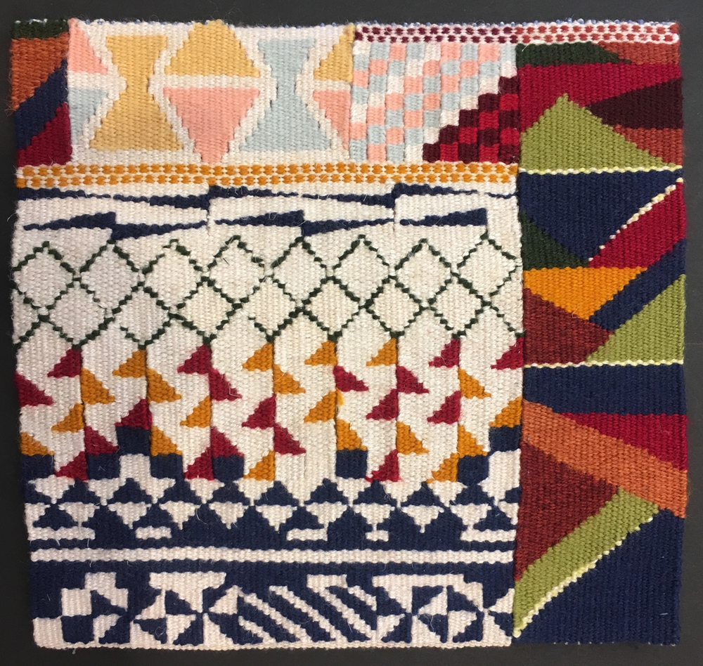
Reconsider 1, 8.5″ x 7.25″
Reconsider 3, 10″ x 8″
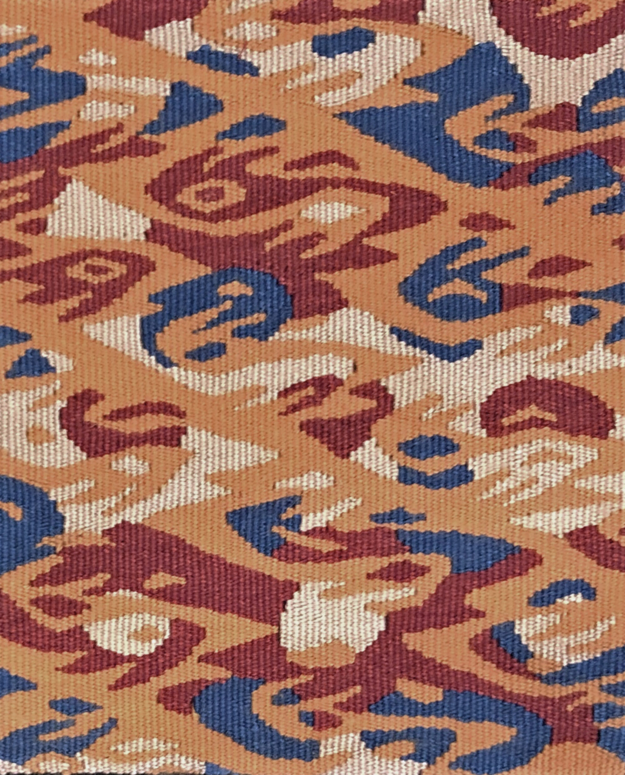
Reconsider 3 is part of a series that explores patterns. I blended patterns from two different Andean textiles, one a combination of stripes and lozenges and the other an abstracted bird form that repeats in mirrored, diagonal rows. My hope is that the different patterns will fuse together in a way that the individual components are recognizable, to some extent, but also merge together to create a new image.
Explorations in continuing themes
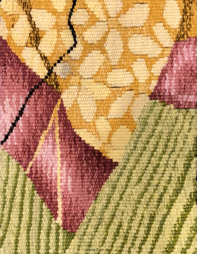
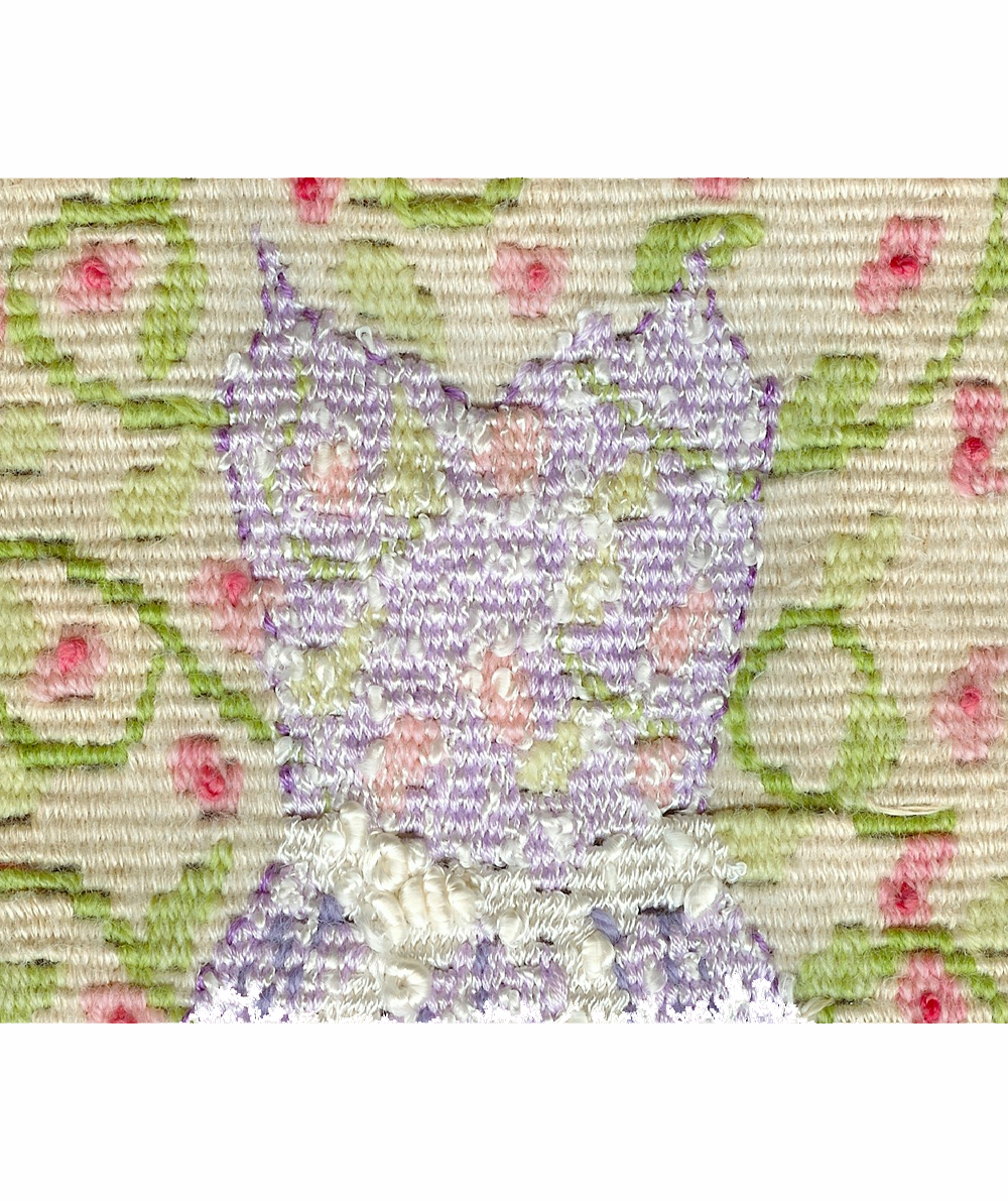
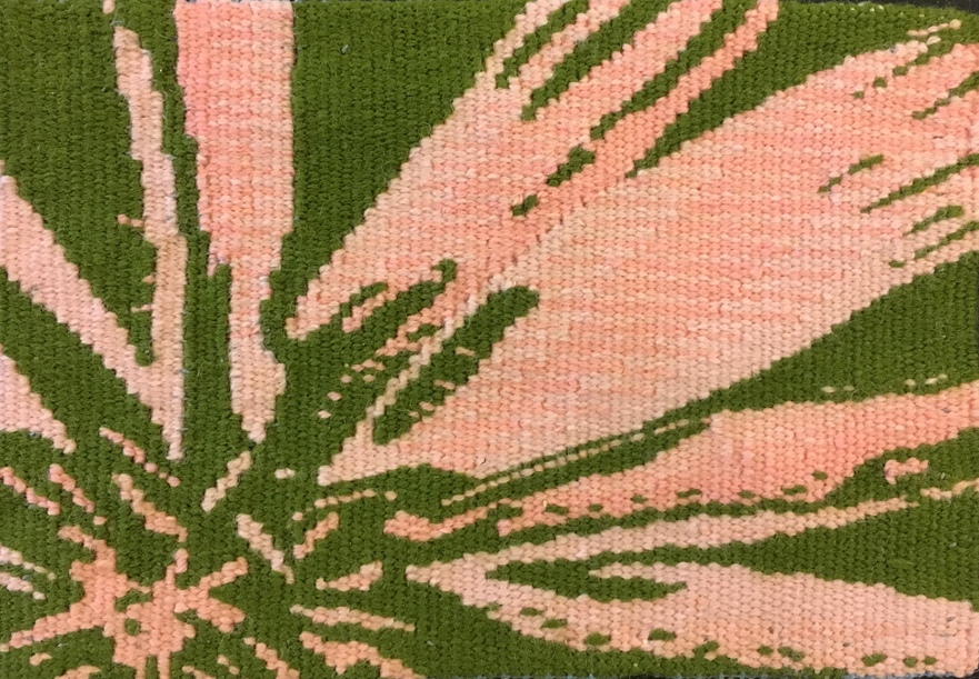
Untitled # 137, detail
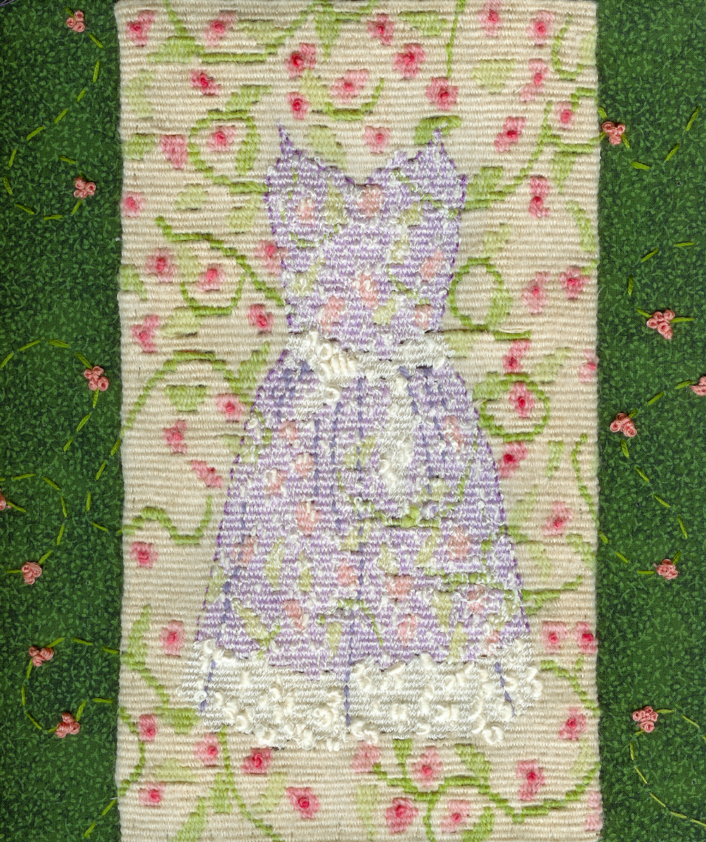
Untitled #139, 10″ x 9”
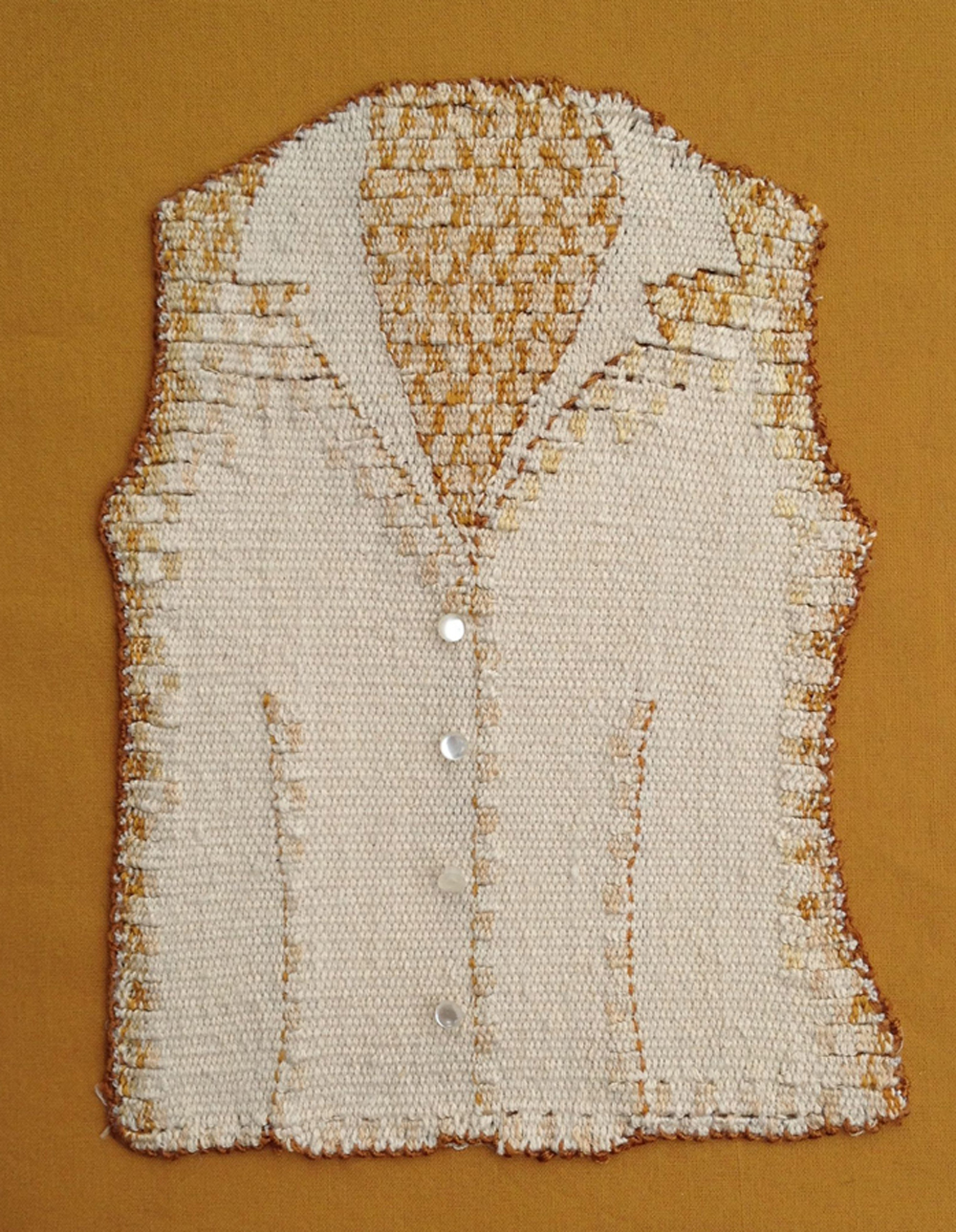
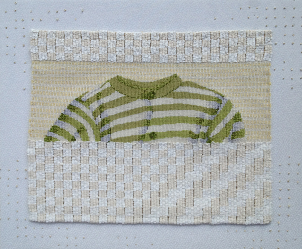
unBUTTON, 9″ x 7”
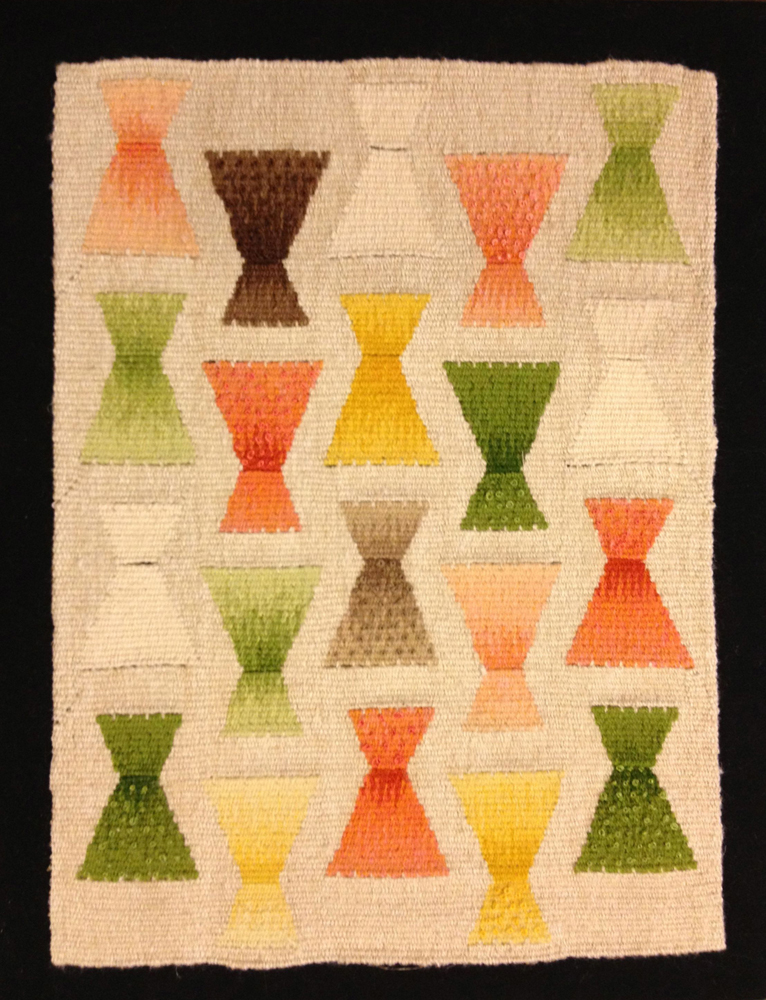
Untitled #140, 15″ x 18”
Lewisia, 5″ x 7″