TheNew Art of the Loom opened in 2013 and travelled to seven venues during 2013, 2014 and 2015. The show was initiated, organized and curated by Dirk Holger. Dirk Holger was born in Germany in 1939. He was a student at the École Nationale d’Art Décoratif d’Aubusson and was the last assistant of Jean Lurçat before the latter’s death in 1966. He designed numerous dreamlike cartoons woven by an Aubusson workshop. He later moved to the United States and lived between Olney, Maryland, and Munich, Germany. He was a tireless advocate for, and witness to, modern tapestry design, organizing exhibitions and lectures on the subject.
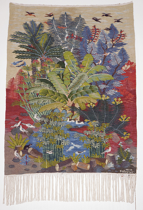
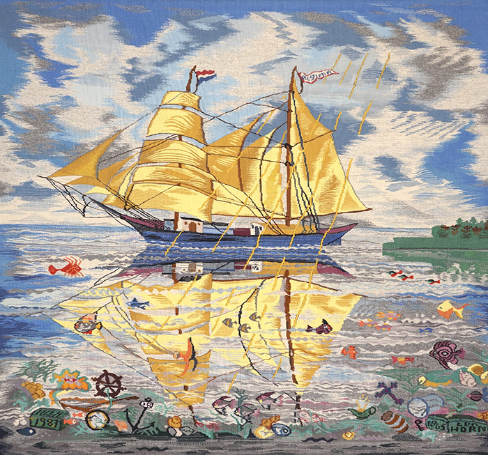
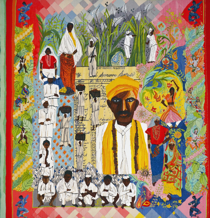
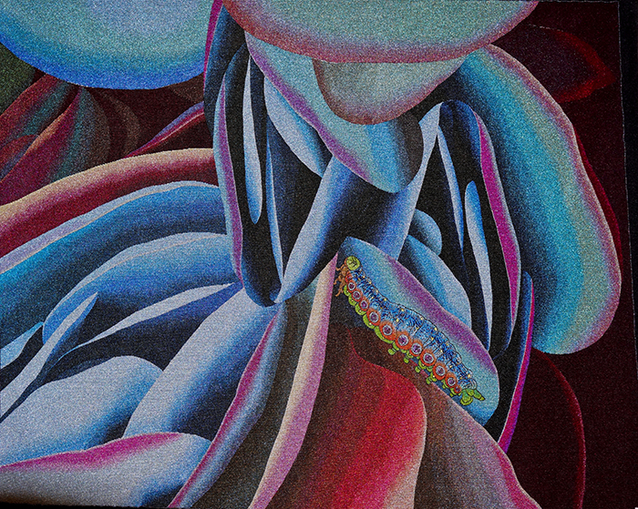
Tapestries from the following artists were included in The New Art of the Loom: Christine Altona, Malgorzata Buczek, Thomas Cronenberg, Thoma Ewen, Susan Hart Henegar, Ibolya Hegyi, Barbara Heller, Dirk Holger, Peter Horn, Susan Iverson, William Kentridge, Lialia Kuchma, Ulrika Leander, Jean Lurcat, Susan Maffei, Sayed Mahmoud, Ann Naustdal, Inge Norgaard, Lorna Ramlochansingh, Jon Eric Riis, Burn Soo Song, Miyuki Tatsumi, Joyce Tien, Henriette Zegers ten Horn.
Below is a brochure printed to accompany the exhibition.
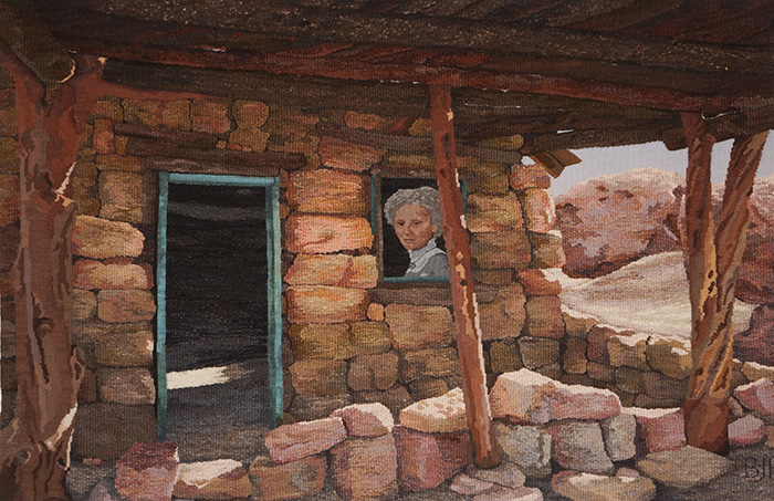
(left) Sharon Marcus, “Anasazi Ruins,” 24” x 24,” 1984. Photo: Bill Bachhuber. (right) “Maghreb,” 26.5” x 28.75” 1983. Photo: Bill Bachhuber. “Trained in anthropology and archaeology, Marcus excavates the elusive and evocative facets of human habitation and landscape in her woven tapestries.” (From a paper given by Mary Lane at the Textile Society of America’s 2024 Symposium. Link to article.)
Sharon Marcus was a Portland-based tapestry and fiber artist whose professional practice spanned several decades. She was an established figure in both the Pacific Northwest fiber arts community and the international contemporary tapestry community. Sharon worked for almost forty years as a studio artist, educator, writer, editor, and organizer. Her tapestries and textile works explore abstraction, landscape, structure, and the idea of “site,” often drawing on archaeological and architectural references and emphasizing perception, materiality, and layered meaning. Her work is informed by European tapestry traditions while being firmly grounded in late 20th century contemporary fiber practice.
I met Sharon in 1981. She brought Ruth Tanenbaum (Rudi Dundas) to the Oregon School of Art and Craft (OSAC) to teach a two week long, intensive class in the French weaving techniques associated with the Gobelins Manufactory in Paris. I signed up for the class. Sharon had a productive and notable career teaching and directing the OSAC Fibers Department (circa 1980–2000), one of the few fiber programs in the U.S and, even rarer, one with a tapestry track. Sharon influenced generations of students through both instruction and mentorship and was recognized for her contributions to education in the field.
Tapestry class at OSAC, 1981. Sharon Marcus is sitting in the middle row on the left. Ruth Tanenbaum is standing in the back row on the right. Mary Lane – standing, second from left. Kathe Todd-Hooker – sitting, bottom left. I’m sorry, I need help with the names of the rest of the participants.
Sharon played a significant role in the international tapestry community as the editor and publisher of the International Tapestry Journal (ITNET) in the 1990s, helping to foster dialogue and collaboration among tapestry artists worldwide. She also served in leadership roles on the boards of The American Tapestry Alliance, Center for Tapestry Arts, Contemporary Crafts Association and The Oregon College of Art and Craft, and as a regional representative of the American Crafts Council. Sharon’s work has been exhibited and discussed in critical and scholarly contexts and is represented in public collections, including state public art programs.
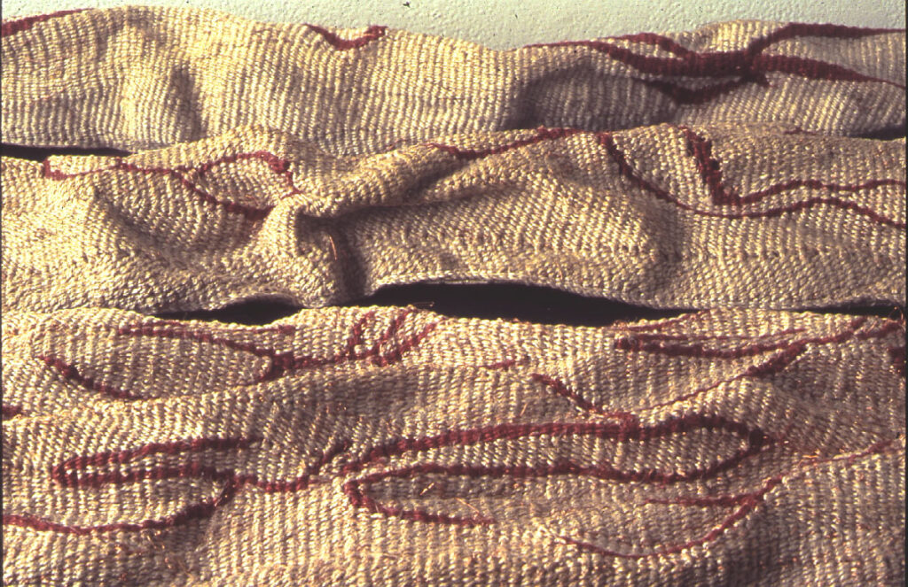
Sharon Marcus, “Facade” and detail. “Using linen and wire for weft, Marcus builds the shape in an intuitive and spontaneous manner, responding to the touch and appearance of the growing fabric. The distorting forces of wedge weave and eccentric weft, the open slits and conventional tapestry joins and surface techniques leave their marks upon the tapestry. The finished weaving is washed, beaten with a hammer to flatten, painted and then burnished. The surface is dense, smooth and stiff. The feel of the fabric evokes tanned animal skin, a deliberate association for Marcus. In Marcus’ words, “[Skin] is a barrier between outside and inside… It is endlessly fascinating for its metaphoric possibilities.” Skin is both a literal and a metaphysical border. It separates the subjectivity of the body from the objectivity of the surrounding world. It mediates between the self and external sensory stimuli. It is conceptually linked to textiles in their role as clothing. (From a paper given by Mary Lane at the Textile Society of America’s 2024 Symposium. Link to article.)
Sharon’s family is in the process of preparing a detailed inventory of her available work and welcomes inquiries from galleries, dealers, advisors, institutions, or collectors with experience in fiber art, tapestry, or artist estates who may be interested in reviewing or handling the material. Please email Andrea Marcus for more information.
Sharon Marcus, “Site,” and detail. Sharon Marcus, 1″h x 32″w x 16″d when lying flat, 1998, linen and wire wedge-weave.
To read more about Sharon’s tapestries and view more images, follow the links to these resources:
Dissolving the Objective Grid: Cultural Excavations and the Work of Sharon Marcus. A paper written by Mary Lane, presented at the Textile Society of America’s 2004 Symposium and subsequently published in the Symposium Proceedings. Click here.
Archaeologies: Structures of Time. An exhibition review written by Mary Lane and first published in the Surface Design Journal, Vol. 20, No. 1. Click here.
An online exhibition Sharon curated for the American Tapestry Alliance discussing the tapestries of Valerie Kirk and Sara Lindsay. Click here.
In the fall of 2019 through early 2020, I wove five small tapestries, all designed in Photoshop, all collaging a variety of source materials in order to come up with the final design. I am going to explain my design process for two of those, Reconsider 3 and Boundless.
Reconsider 3
These details from two historical, Andean textiles are the source materials for Reconsider 3’s design. They portray a bird motif (above left) and a geometric motif (above right).
The above left image is a screenshot of Photoshop’s Layers menu. It shows that there are three layers in this design. Layers are a fundamental aspect of Photoshop. Anything you introduce into the Photoshop file can become its own layer, which can be manipulated in many ways. They can be altered, joined with other layers, interact with other layers, and much more. The order of the layers is important because it governs which layers can interact with each other. The screenshot of the Layers menu shows that the bird motif textile sits on top of the geometric motif textile. A background layer, which is solid white, sits underneath the other two layers. The image on the right is a screenshot of the Blending Options menu. Blending bleeds images into each other in specific value ranges. Each layer can be blended with the layer below and/or above it. The screenshot shows the blending settings for the bird motif textile, which is the top layer. It is set so that the underlying layer – the one with the geometric motif – will bleed through in the darker values of the bird motif textile.
The white areas in the above left image are where the darker values in the bird motif textile were and where the underlying geometric motif textile will show through. In the middle is the composite, blended Photoshop image, the design for Reconsider 3. On the right is the completed tapestry.
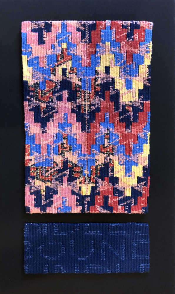
Boundless
Boundless is two separate tapestries mounted together. The top tapestry follows the line of investigation I was pursuing in designing Reconsider 3. The bottom tapestry introduces the title of the piece, although the cropping and the text dissolving into the background makes reading it elusive.
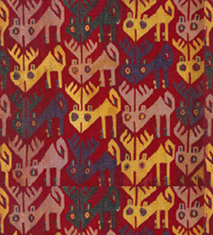
The source materials for Boundless are a detail from a kilim (above left) and a detail from an Andean textile (above right).
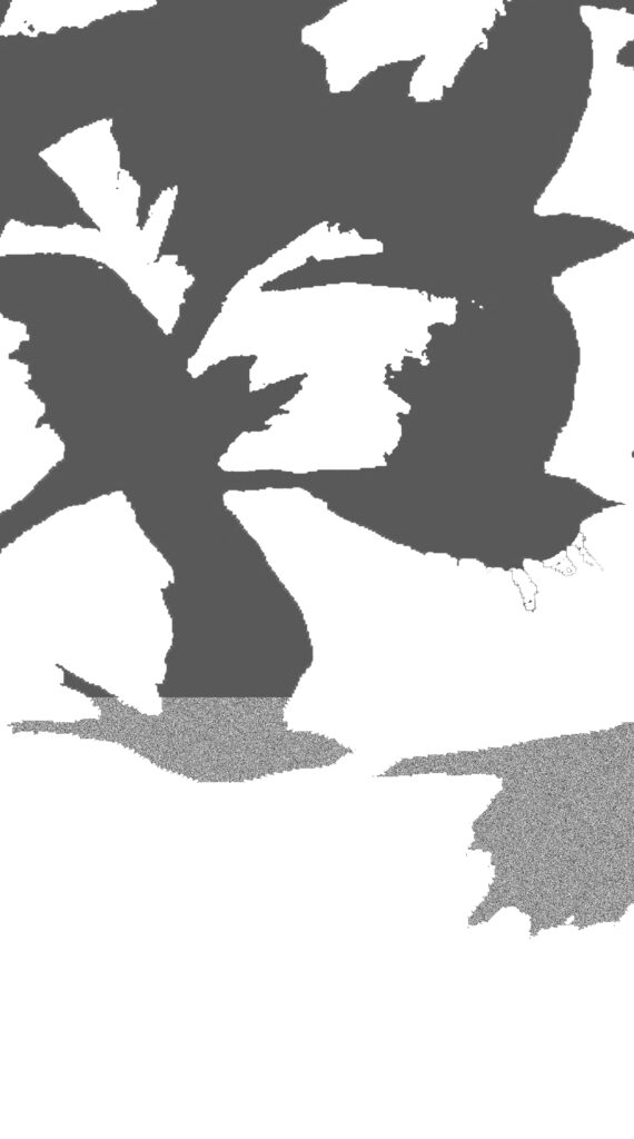
The screenshot (above left) shows that there are 16 layers in the Photoshop file. This is quite a few more than in Reconsider 3 but most of them are just setting up the repeat of the detail from the Andean textile. The right image shows the repeated pattern – two columns of seven. The Layers menu shows that the kilim sits on top of the 14 repeats. A white background layer is the 16th layer.
The Blending menu (left) is for the kilim layer, the top layer. The kilim is set to bleed through in the lighter values, revealing parts of the repeated motif below.
You can see those areas in the image, below left. They are a gray checkerboard. In addition, the underlying layer – the 14 repeated elements – is set to bleed into the upper kilim layer in its lighter values. It is the combination of these two settings that produces the finished composition, the design for the top section of Boundless (below middle). The tapestry is below right.
Since I have been working with this method of designing, I have been trying, true to my systematic nature, to figure out how to predict how two different images are going to blend together. I can’t say I have been entirely successful. I have been able to identify certain characteristics that make for interesting blending, but I am constantly surprised by what happens when I start playing around with the blending options. Sometimes magic happens and sometimes it doesn’t. I have many, many experiments that have not led to anything I find interesting. But that is often the case with designing, no matter what kind of process you employ. A lot of experimentation is often required, working and reworking, to come up with a successful image.
The part of Boundless that contains the title of the piece involves a simpler kind of blending, one that controls the opacity of a layer across the entire image. There are different ways that the blending can happen. In this case the diffuse option makes the lettering merge into the blue background.
An earlier version of this article was published in the Tapestry Weavers West newsletter.
Recently, my regional tapestry group, Tapestry Artists of Puget Sound, began a group project in which each of us would weave a tapestry, or maybe more than one tapestry, that was inspired by an existing textile. Beyond that, there were no other stipulations. The chosen textile would serve as a springboard for a design that could evolve in any direction that caught our attention. Because I often use references to historical textiles, or even incorporate details out of historical textiles, into my tapestry designs, I engaged with the project easily.
My first “springboard” textile was an Andean tapestry fragment. There may be a face nestled into this very busy weaving, but much of it shows a variety of stepped, meandering and checkerboard motifs. It appears that the horror vaccui people often use to describe European Medieval millefleur tapestries influenced Andean weavers, as well.
Borrowed Language 1 source textile – Andean
(left) Borrowed Language 1 design. (right) Borrowed Language 1, tapestry, 12”x8,” 2024, cotton warp, wool weft. Photo: Mary Lane
I excerpted motifs from the Andean textile, altered them a bit and arranged them in a variety of patterned compositions until I came up with something that I liked. Because I saw the different motifs and shapes as weaving language, I called the piece Borrowed Language 1.
In this tapestry I reengaged with a feature of weaving patterns that I had explored a few years ago in weavings that I called Woodles – woven doodles – borrowing this term from Kennita Tully. The feature of weaving patterns that I refer to, is the fact that, to weave patterns, the number of warp threads needed for each element must be calculated so that the repeats fit within the width of the tapestry and the number of warp threads contained in that width. Or, conversely, one can let the number of warp threads needed to weave the repeats of the patterns determine the width of the tapestry.
Because I did not want to weave on single warps, I assigned each vertical line two warps. Given the intended size of my tapestry, this meant that I had room for four repeats of the gold motif, instead of the six repeats that are in the Photoshop design. I altered the white motif, as well, so that I could fit entire repeats of the motif within the number of warps I had available. I find that thinking within the constraints of a pattern – calculating the number of warps needed to weave it, or altering a pattern in order to weave it with the number of warps upon which you have already decided, to be a great mental exercise.
My second tapestry in this series, Borrowed Language 2, was also based on an Andean textile. I wanted each piece in this series to be the same size, so that was another “given” that imposed limits as I extracted motifs from the source textile and simplified or altered them for this second tapestry.
(left) Borrowed Language 2, design. (right) Borrowed Language 2, tapestry, 12”x8,” 2024, cotton warp, wool and cotton warp weft. Photo: Mary Lane
In Borrowed Language 2, I wove the red background with boucle yarn and the patterns with cotton embroidery floss so that the material differences in the two yarns became an additional feature of the tapestry.
Possible designs for the Borrowed Language series
As I alluded to, this project was interesting to me because I enjoy looking at, thinking about and riffing off historical textiles. I may weave a few more pieces for this project. I worked up some potential designs with the Borrowed Language series in mind, but instead of creating them in Photoshop, I drew them with markers or colored pencils.
While I was working as the Executive Director of the American Tapestry Alliance I produced a video entitled Contemporary Handwoven Tapestry for The Textile Museum in Washington D.C. Watch it here.
(left) Gabriela Cristu (Romania) Prelude to the Afternoon of a Faun, 59″x72″ (right) Liev Beuten-Schellekens (Belgium), Imagination, 51″x53.5″
Several people have asked how I developed the design for my most recent tapestry, Wander. I’ll make a stab at explaining it here.
Wander, 53″ x 30″
My most recent work (see Boundless and the Reconsider series here) references historical textiles through the incorporation of borrowed patterns, motifs and/or details from actual historical tapestries. The textile excerpts are combined with each other, and with other image sources, such as drawings or photographs, to produce a layered image in which the different components are merged together into one blended image.
Wander combines details from an Andean textile showing a pattern of Brockett deer, a photograph of rocks, a drawing of birds in flight and a pattern from a Berber carpet. The diagonals in the rug pattern and the flying birds suggested the title Wander, which I incorporated as text into the tapestry.
The design is collaged, layered and blended in Photoshop. It went through 27 different morphs along the path to its resolution. The final version has 14 layers.
One layer is an Andean tapestry depicting a pattern of Brockett deer. Two layers are themselves collages of different parts of a drawing of flying crows.
Layer: Andean tapestry with Brockett deer
Both layers showing collages of different parts of a drawing of flying crows
Five layers are a detail from a Berber carpet repeated. Two of the layers are the text in the image.
All five layers of the Berber carpet detail
Both text layers
One layer is the rock layer. The rock layer is a crop from a rock wall which I then altered with the Cutout Filter in Photoshop. Two layers make up the bottom section of the tapestry. They are a crop from the rock layer repeated – first right side up and then upside down.
Rock layer
Two layers that make up the bottom section
The last layer is the background, which is a dark grey.
I used the Blend If and Dissolve functions in Photoshop to merge the different layers together. Dissolve bleeds images into one another. You can control the degree to which they bleed but the bleed is the same across the entire image. That works well for certain situations. For example, I used the Dissolve function to merge the text into the Berber carpet. The Blend If function allows for a more sophisticated merging of images. You can control the amount that the top layer bleeds into the bottom layer (or the bottom layer bleeds into the top layer) at different points along the value scale. So, for example, the Brockett deer tapestry bleeds through the rock layer only in the darkest value. Positioning the layers with respect to each other is critical in controlling which layer bleeds through to another. The possibilities are mind boggling and that is why I had 27 renditions of the image. I usualy find it is very hard to decide that an image is finished.
Another reason I had so many versions of this design is that I took Gerhardt Knodel’s class, Mining Historic Textiles as a Route to the Future, when I was working on this design. You can read about my experience in that class on Ellen Ramsey’s blog. Before the class, the design was just the section above the Berber carpet. Gerhardt talked about creating disruptions in designs and it was that thought that inspired me to work more on this design, adding the carpet pattern, text, and repeated section on the bottom.
Just in case you are interested, this is what the interface looks like for one of the text layers of this particular design.
Photoshop interface showing the Layers window (some layers, from previous versions, inactive) and the Layer Style window for one of the text layers.
I enjoyed weaving this tapestry. It was scaled well for the size, 53″ x 30,” and warp sett, 8 ends per inch. There was a lot of “noise” in the image – little dots of color. I like to strike a balance between blended colors (different colors in the weft bundle) and colors that are solid. Because the colors in the background and the section with the Berber carpet were quite variegated, I made the colors of the birds and the Brockett deer tapestry flatter than they were in the design. I used hachures and battage to blend the colors in the background and to create the patterns in the Berber carpet.
I am working on several more designs using this design process and I look forward to finishing one for my next tapestry.