This paper was first presented at the symposium, Looking at Tapestries: Views by Weavers and Scholars Chicago, IL, 2003. It was later published on the American Tapestry Alliance website. Minor modifications have been made for presentation in this format.
Susan Martin Maffei began weaving tapestry in 1985. She attended Parsons School of Design in New York City, and then began an apprenticeship at the Scheuer Tapestry Studio. Maffei also studied with Jean Pierre Larochette and Yael Lurie and, in 1987-88 she completed a nine month stage at Les Gobelins in Paris. Her work has been exhibited and collected widely and she is known by many as a dedicated and inspired artist and teacher.
Maffei is a consummate weaver. Her diverse training has resulted in a broad range of skills that would allow her to work from designs in a wide variety of styles and media. However, it is her interest in tapestry itself and her familiarity with historic tapestries from many cultures, that has led her down a very specific and focused path of inquiry. Since the late 1980s Maffei’s work has represented a sustained attempt at integrating the weaving process, the structural qualities of tapestry, the materials and her image into a conceptual unity. It is this pursuit, and its intersection with specific historic tapestries that I will discuss today.
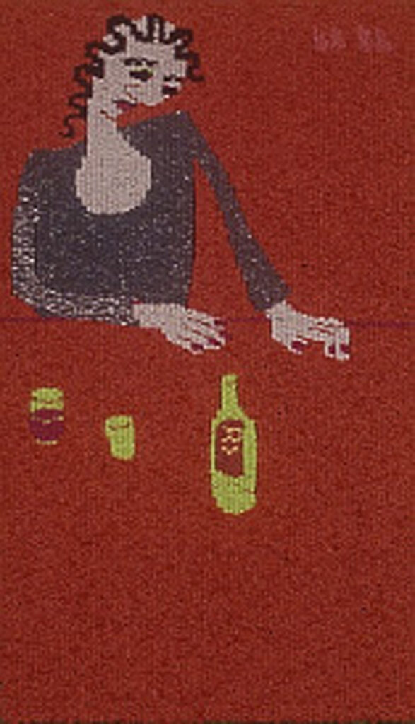
Maffei’s work focuses on the world around her, and especially on the people that inhabit that world. For most of the year she makes her home in New York City and the city and its people serve as inspiration for much of her imagery. In portraits such as “Redhead in a Blue Sweater,” “Girl in a Red Room” and ”Laura” the focus is on the individuality of the person. The quirky, or ordinary nature of the face, the clothes, the posture, the expression – all of these traits define the character of the subject. Each tapestry, however, represents not only a personality for us to meet, but also a chance to follow Maffei’s exploration into what, if any, characteristics are truly fundamental to tapestry weaving.
Maffei is interested in as direct a connection between the image in her mind and the image on the loom as possible. Several aspects of her working method reflect this interest, including weaving most of her tapestries from the bottom to the top and weaving the image from the front of the piece instead of the back. Both of these aspects allow her to follow more closely the development of the image without relying heavily upon a maquette, or drawing, as most tapestry weavers do.
For many, the relationship between the maquette and the woven image is fairly literal. For others this relationship becomes a never ending question and struggle. “If the tapestry is the point of the project, how can I give it power over the drawn image?” For Maffei the answer to this question has involved learning to think and design within the conditions of tapestry weaving, rather than using tapestry’s great technical potential in the service of a painted or drawn image. She has developed a technical facility that allows her to weave fairly directly, or with minimal small scale sketches. Her aim is to eliminate the intermediary stages that most weavers use between concept and tapestry.
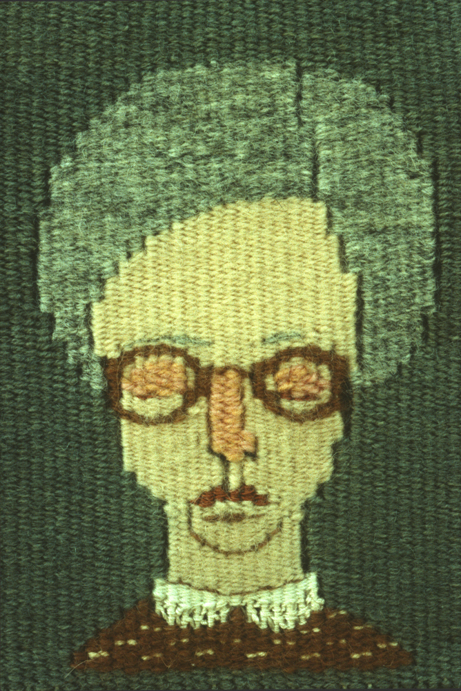
In tapestry with discontinuous wefts each color area is worked independently. Shapes underneath are woven first and covered by other shapes. The slits, or gaps, that form between two adjacent shapes, and especially between shapes with steep, stepped lines, create shadows which appear as dark lines, or outlines. In these two tapestries they define, for instance, the facial planes and the muscles in Claude’s neck and the part in Clarissa’s hair. The use of slits to define forms was common in Medieval tapestry and is an example of how a by product of the weaving process can be used as an element in the design. Maffei calls attention to the slits and the steps of steep lines, such as those around Clarissa’s head and neck, as positive marks of the tapestry process.
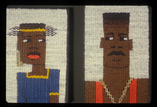
Maffei’s emphasis on the structure of tapestry weaving is even more apparent in “Who Sees Who?.” Instead of carefully rounding the bodies and heads, she exaggerates their angularity, insisting that the image yield to the logic of the grid of warp and weft, rather than manipulating the geometry of the weave to serve a drawn image.The bright colors emphasize the independent shapes that result from the weaving process. The curl in the horizontal strands of hair is simply the result of working with the highs and lows of each shed. The very conditions and byproducts of the weaving process become motivating factors in Maffei’s designs. She is designing within the grid of the weaving.
Highlighting the process through the design reminds us that tapestry is not just a vehicle for depicting images but also a piece of cloth. The conversation between the two dimensional nature of the cloth and the three dimensional world that is her subject matter will continue to be an active agent throughout the work we look at today.
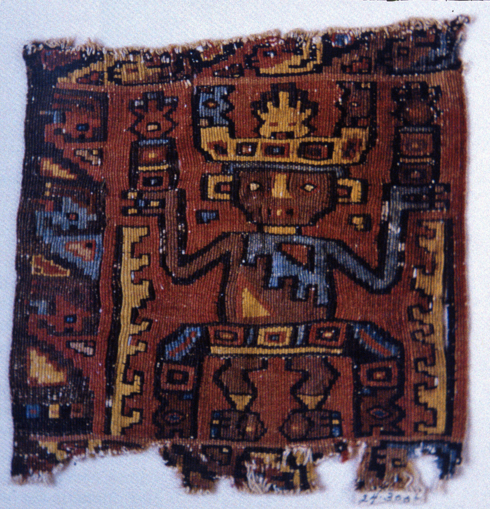
Staff Bearer Middle Horizon Wari related, 19.4cm x 18.4cm, 500-800 CE
Maffei’s emphasis on designing within the parameters of tapestry process and structure is also characteristic of Andean weaving. According to Pierre Bordieu, “the act of working conditions … [weavers’] minds to think in significant ways….. the actual practice of a complex cultural activity such as textile work teaches people how to perceive and understand the meaning of it, and this understanding in turn changes and enhances the manner in which people practice their culture.”1 In other words, the practice of weaving produces a conceptual understanding of the medium that in turn influences the way the weaver perceives, and represents, the world. The Middle Horizon fragment depicts a staff bearer, who like the figures in “Who Sees Who?,” is defined completely within the geometry of the weaving. Although this image is more highly patterned than Maffei’s, it shares the underlying motivation in her work of letting the medium itself govern the rendering of the image.
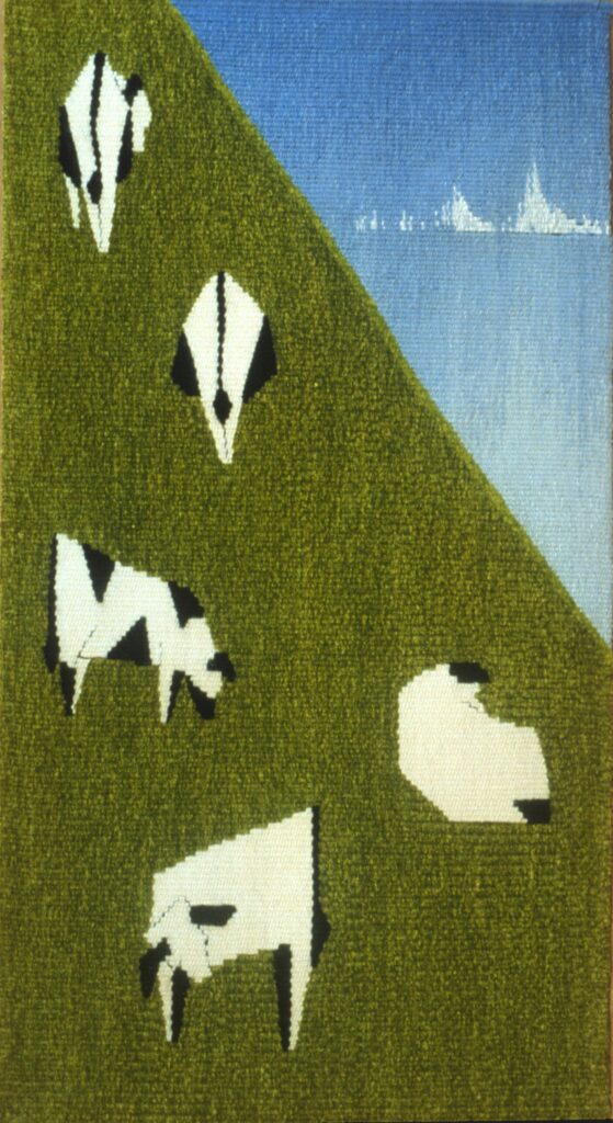
In a series that Maffei wove while living on Maui cows are distilled into geometric, interlocking shapes. The level of abstraction reflects her interest in exploring the interaction between an image and the woven grid. The geometric style and the high color contrast flatten the image so that even the division between land and sky in “Cows in Triangles” seems to be a compositional decision, rather than an illusion to a landscape. However, the idea of space is not rejected. The foreshortening of the cows’ bodies as they face either towards, or away from the viewer suggests the three dimensional space that they occupy. The ambiguity introduced by simultaneously affirming space through the foreshortened bodies and denying space by reducing the images to flat blocks of highly contrasting colors, reminds us that the struggle between the flatness of the textile and the representational illusion to three dimensional space is an ongoing question for Maffei. Her approach suggests that it may be more interesting to explore the question rather than declare an answer. Her process of distillation comes to its ultimate in “Black and White Cows in Snow and Night,” in which the cows are reduced to a series of calligraphic marks on a blank field, each tapestry being a color and directional reversal of the other.
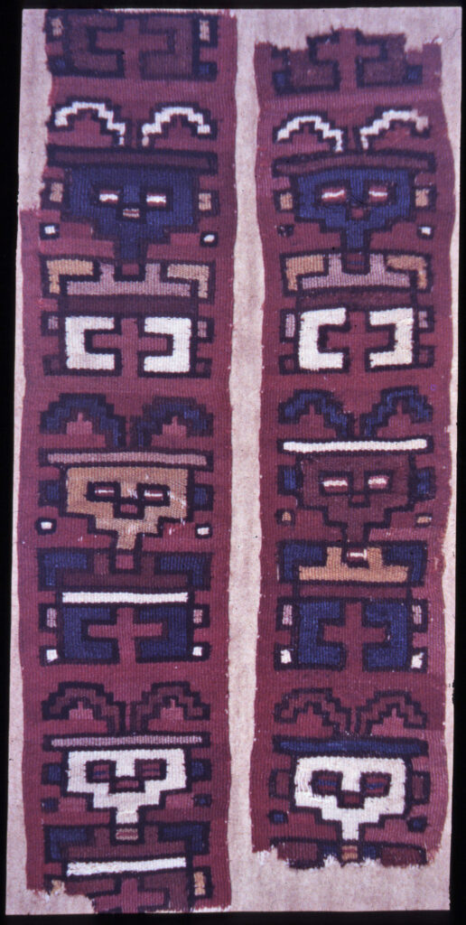
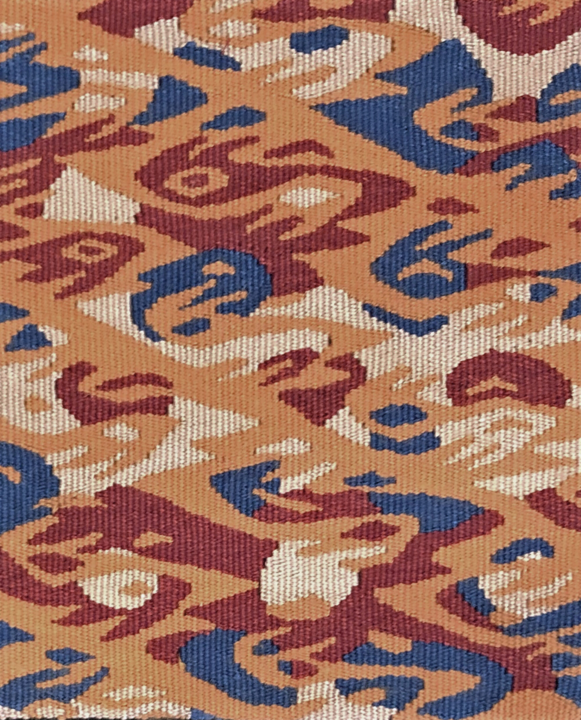
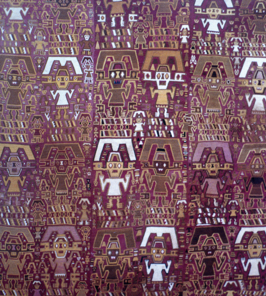
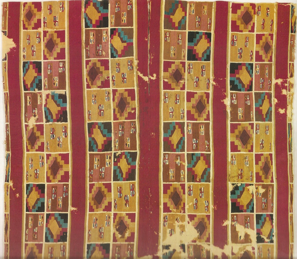
Maffei’s use of strongly contrasting, flat colors and her interest in abstracted images reflects her study of, and admiration for, Andean textiles. Pieces such as this small fragment are examples of the sophisticated Andean aesthetic which reduces images to geometric units and repeats them across the field. The patterns, however, are not static. They are enlivened by shifting hues, values, asymmetrical patterning and the introduction of intentional irregularities. The dynamic, contrapuntal rhythm produced by these variations and the shifting positions of foreground and background transform these patterned images into lively, compelling designs.
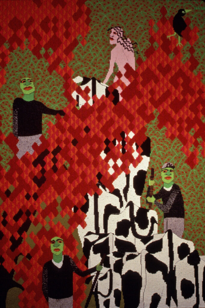
In Maffei’s “Herding the Cows” we see this same tactic used in the red foliage of the trees. The diamonds shift in value, suggesting the play of light on leaves. The interest in animating the entire surface of the weaving through a modulated pattern is not only reflective of Andean weaving but also of early European tapestry, another source of inspiration for Maffei. This detail from a tapestry showing “Wild People on a Hunt” shows the use of patterns throughout the image.
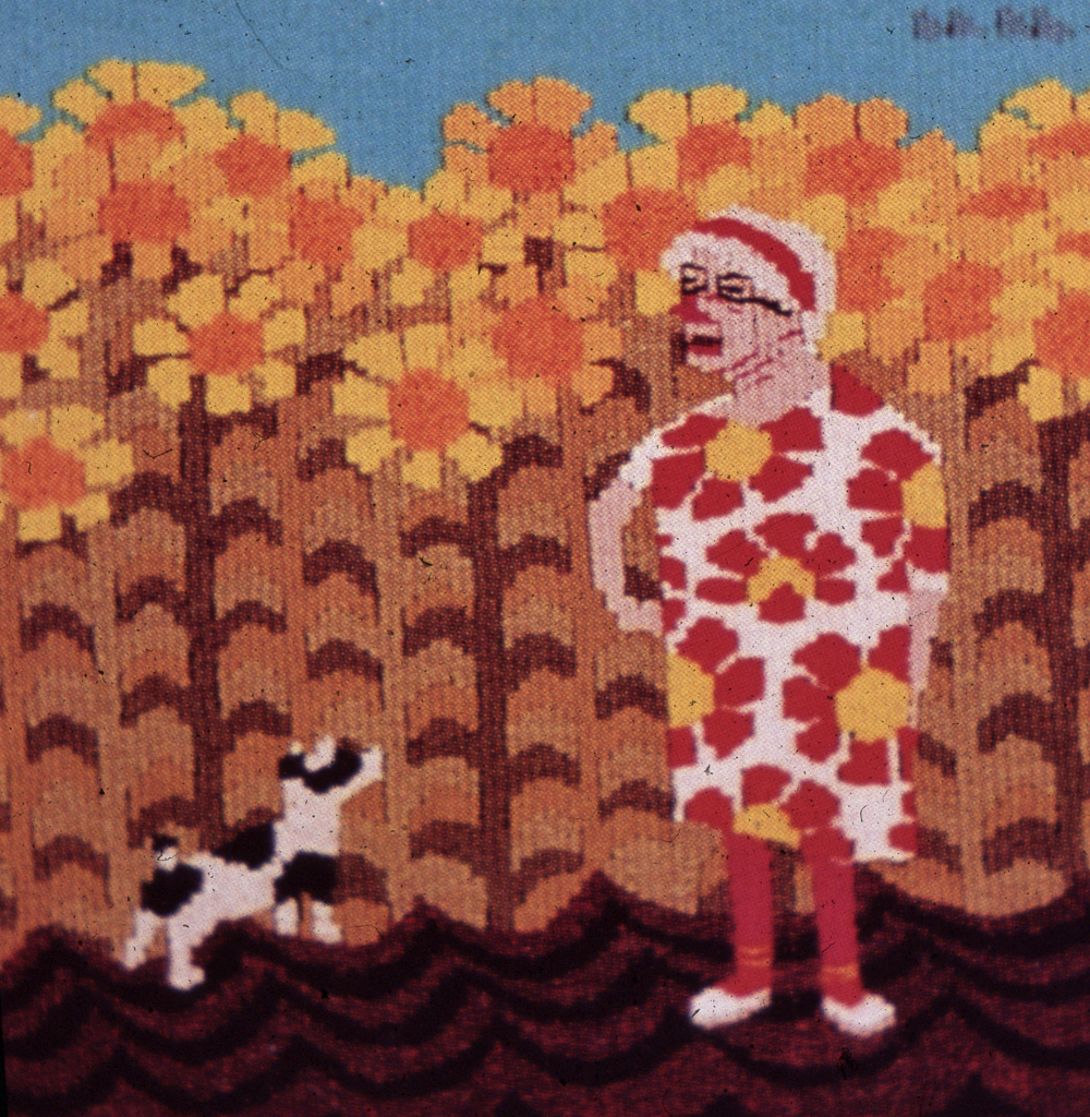
The Andean aesthetic of abstraction, dynamic patterns and strong color contrast is also reflected in “Her Favorite were Sunflowers and her Dog was Blue. ” Where Maffei’s work differs from her Andean influences, however, is in her interest in the personality or character of the people inhabiting her tapestries. In the Andean pieces, there is little interest in psychological nuance or anecdotal detail. The figures, animals and composites are more symbolic than real. Many are representations of spiritual beings. In Maffei’s work, however we sense, despite the flattened and patterned surface, the individual personality and the minor events that make a person’s life unique. Maffei’s interest in narrative reflects the influence of European tapestry. In the 15th Century tapestry showing “Wild People and the Job of Farming Wheat,” the rendering of the wheat as a pattern can be compared to the patterns of the sunflowers in “Blue.” In both pieces we see a day in the life of the subjects of the tapestries. Maffei incorporates the principles that underlie the extraordinary, textile based strength of Andean and early European tapestry at a conceptual level and then uses them to develop images that reflect her own culture and interests.
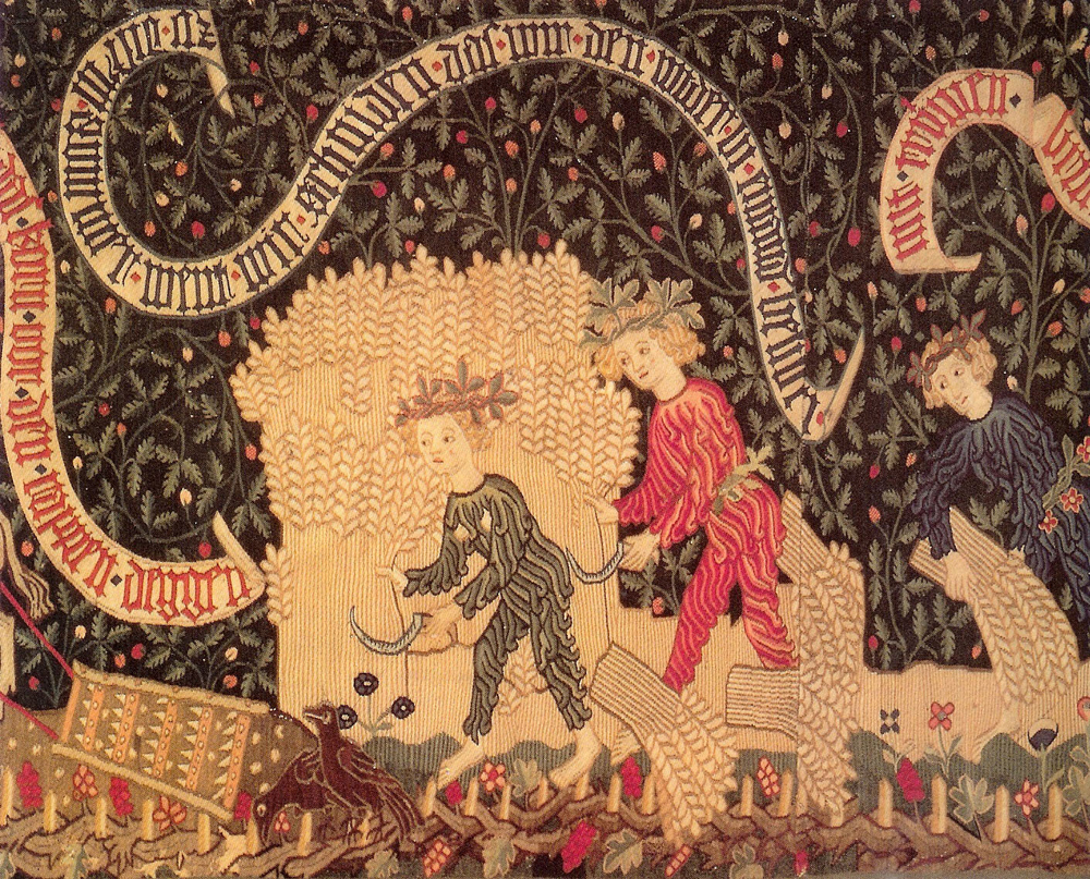
Pattern is closely associated with weaving, not only because of its prevalence in the textile traditions of so many cultures, but also because repeated imagery reflects the repetitive structure of weaving, under then over, under then over. For many, patterned imagery seems to make fundamental sense.
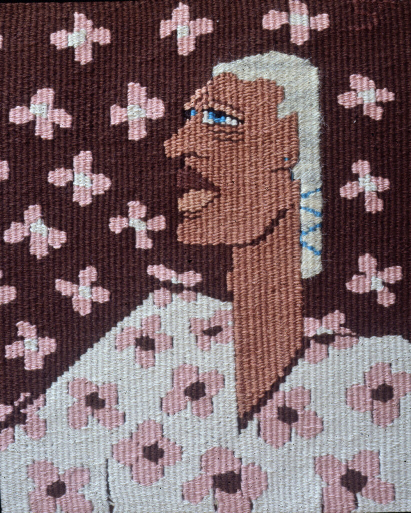
Maffei uses pattern, both for its visual beauty and as a compositional tool. In “Flower Man” the image of a man in profile is completely covered with a pattern of pink flowers. The flowers’ role shifts from being a shirt pattern to being a wall paper pattern, missing only a small beat at the junction. Because of the flowers’ uniformity and the way they cross the boundary between wall and body, they tend to equalize and flatten the foreground and background of the image.The darkness of the wall recedes behind the figure, but the high value contrast of the pink flowers on the dark wall makes them pop forward. The white of the shirt advances, but the low value contrast of the pink flowers on the white pushes the figure back and the brown centers of the flowers on the shirt bind the shirt with the wall. Her playful manipulation of space, points out the arbitrary nature of spatial conventions and makes the work compelling.
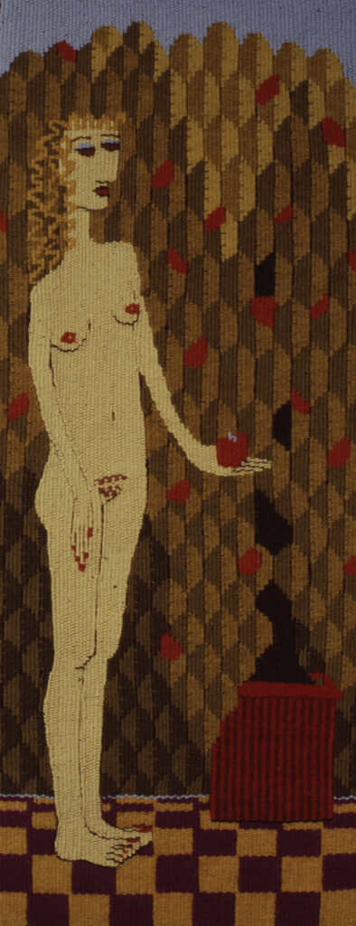
In “Eve II,” one in a series of pieces on women in history, pattern is used to suggest the foliage of the garden. The juxtaposition of light, medium and dark values within the pattern is reminiscent of both the more abstract patterns of pre Columbian tapestry seen in this fragment and the use of pattern in the more representational images of medieval European tapestries, such as this detail from “The Hunt of the Unicorn” in which the foliage is a pattern of shapes that alternate between dark, medium and light. In “Eve,” the pattern and the directionality of the light source suggest the light and shadow on the leaves. The decreasing size of the tiles on the floor suggests spatial recession. Yet, the uniformity of the pattern in the shrubbery and the steeply tilting floor reminds us that spatial illusion is the product of conventions of pictorial depiction that are accepted within a culture and within a specific time period. Maffei seems to be playing a game, or having a dialog with the two sides, flipping a coin which half the time lands with “affirm space” up and half the time lands with “deny space” up. The conventions of spatial representation become one of the subjects of her work.
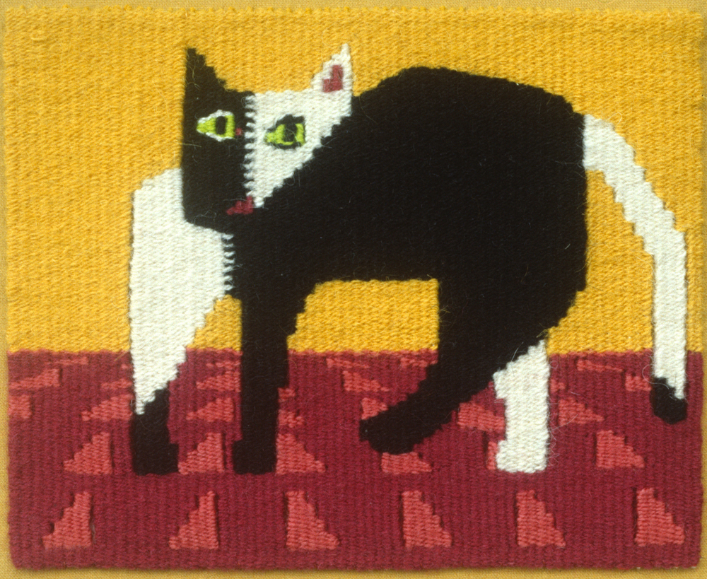
Maffei’s use of a diminishing scale in a pattern to suggest roundness or recession is also seen in pieces such as “Women with Cat” and “That Cat.” This technique was also employed by the consummate Wari weavers. In some tunics, the figures in the bands towards the outside of the body are compressed in shape and size. Rebecca Stone Miller speculates that the rounding effect of this illusionistic trick would have made the wearer appear larger.2 Maffei’s interest in and respect for the accomplishments of the Wari weavers is shown through the adaptation of this technique to her own ends.

In “Joan” and “Mary” we see again the interest in pattern and the very deliberate manipulation of spatial conventions. In “Joan” the scale of the pattern in the shirt is increased and decreased so that it suggests the roundness of the breasts, a further adaptation of the motif compression seen in the Wari tunics. Here the pattern not only changes from smaller to larger, it also moves off the horizontal register and becomes curved. The pattern in the skirt, however, remains completely flat. The bright pattern of the skirt pushes forward, further confusing the spatial relationship between the rounded bodice and the flat skirt. In “Mary,” the only suggestion of space is in the abrupt shifting of the pattern in the clothing where the the two sides of the garment overlap in the front. The bright, aggressive yellow used in the background moves forward and unites with the yellow of Christ’s shirt, again flattening space by uniting the foreground and background.
The marks used for the very graphic shading on the faces and necks in both of these tapestries rejects the idea of subtle, illusionistic shading, celebrating instead the graphic mark making of the woven color blending techniques. This small fragment from Northern Europe shows a similar application of flat pattern on a garment and a stylized rendering of hair.
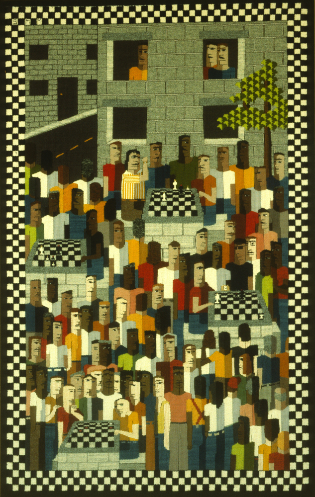
Maffei’s method of weaving without a cartoon might be believable when we consider the smaller pieces or the tapestries with single figures that we have seen to this point. However, her facility in thinking directly through the warp and weft has grown in ambition. “Washington Square” is an early example of how all the factors present in Maffei’s work – the emphasis on discrete shapes, the use of strong flat colors, the manipulation of pattern and the shifting spatial planes are brought to play in developing an image which is more complex pictorially and narratively. Maffei speaks of her process in the following way,
“ I form a visual picture in my mind of the possible overall structure or composition. … Sometimes I will resort to thumbnail sketches to try and clarify the overall tonal relationships. … I…begin to weave. The first bit being the most crucial since it can often set the scale for everything to come. In most instances the piece will follow the general overall image and the working out of details is what allows the the day dreaming aspect of long hours to develop the story.“ 3
In Washington Square figures build upon figures in a vertical fashion, one shape on top of another as the weft progresses up the warp. At a distance the crowded group becomes an abstract pattern of contrasting values and colors. Up close we recognize the individual elements of the image. Maffei states,” I see the overall image and the mark making of the details as two separate items that work on different levels and develop at different times to form the whole.”4 Different levels of interest at different viewing distances is also a characteristic of medieval European tapestry. At a distance tapestries such as “The Vices Beset Sinful Man” appear as a broad composition of figures and action. Despite the difficulty of reading the image at this distance it holds our interest because of the way the placement of the colors creates a dynamic movement across the field.Up close we see the individual details of dress and action that allow us to recognize the specifics of the narrative.
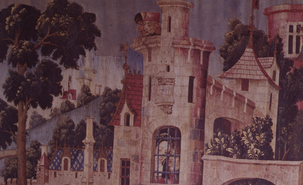
In “Washington Square” figures and buildings overlap each other, but the sense of three dimensional space is confused by the density and uniformity of the figures, the use of strong, flat colors, the exaggerated recession of the chess board, highlights occurring on different sides of the windows, the flat cutout appearance of the buildings and the lack of a horizon line. The large figures peering out of the tiny window in Maffei’s tapestry are reminiscent of a detail from the 6th tapestry in “The Hunt of the Unicorn” set. “Washington Square” is both a lively and patterned narrative of chess players and, through its mixed messages regarding space, a commentary on representational conventions.
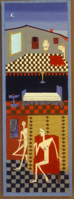
“Two Men” also shows a combination of spatial conventions. The image presents a cut away of a house, or apartment. The position of the men, one seated with his legs folded and the other leaning against a door affirms their three dimensionality, but the uniformity in the size of the floor tiles and the bright, strongly contrasting colors flattens the image into a collection of shapes and patterns sitting on the surface of the cloth, which is, we might hear the artist reminding us, exactly what it is. On the second floor the low ceiling, the steeply angled floor and the bed with its own lines of convergence further confuse our understanding of the space. Finally, are we to understand the top line of the building as the roof line, or the converging of the two walls of the third floor, or both? Instead of using the techniques of tapestry in the service of the image, Maffei seems to be using the image to point out the conventions of representation. Or perhaps she is searching for the point at which each serves the other.

“Two Men” demonstrates Maffei’s interest in developing the narrative of the image, in this case three floors of a house, in a vertical manner, congruent with the process of weaving the image on the loom. This approach is also the modus operandi in “Road to Haleakala” and “Kula Road”. The roads wind up the mountain, dipping out of sight as they drop into valleys. At the same time they sit on the surface of the image like a flat ribbon, barely changing width as they climb up the tall, steep mountain. In contrast to the insistent bottom to top directionality of the piece, a bicyclist flies down the road from top to bottom. This fascination with finding imagery which mirrors the direction of the weaving culminates in “Dominoes, New Zealand,” in which Maffei plays a game of dominoes with her self as she weaves the tapestry. In “Dominoes” she has woven individual playing pieces for a set of dominoes.
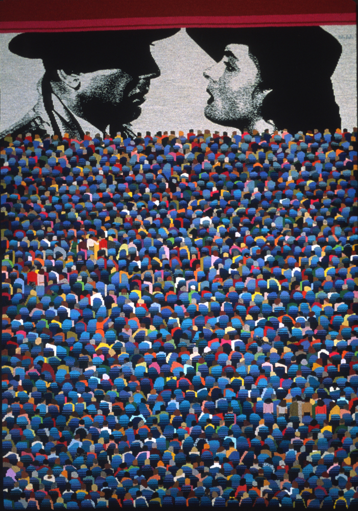
Maffei’s tapestries have grown larger and more complex. In “Deux Mille Yeux, Deux Milieux” the image of a movie theater grows row by row on the loom from the back of the theater to the front. The crowd is built from similar, but not identical shapes. The image is at one and the same time a theater full of people and an abstract pattern.
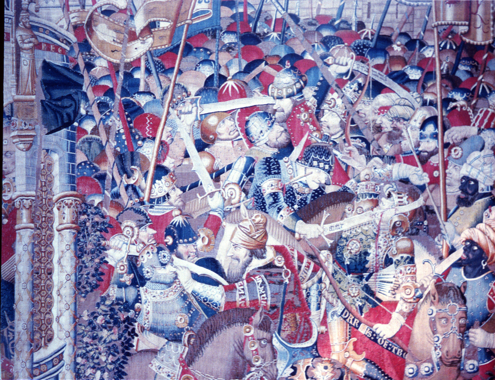
A similar effect operates in the tumultuous and crowded battle scene from the 15th Century “The Trojan War” series. In both cases the placement of color organizes a dense and crowded image into a lively mosaic. In a similar way, the overall pattern in this Late Horizon mantle is animated by the random placement of hues and values among the repeated figural motifs. Maffei thought about what would be playing at the theater as she was weaving the audience, settling finally on this recognizable scene from “Casablanca”. The stylistic contrast between the colorful, abstract pattern of the crowd and the black and white photo realistic rendering of the movie points out the cultural conventions that define different styles of representational imagery.
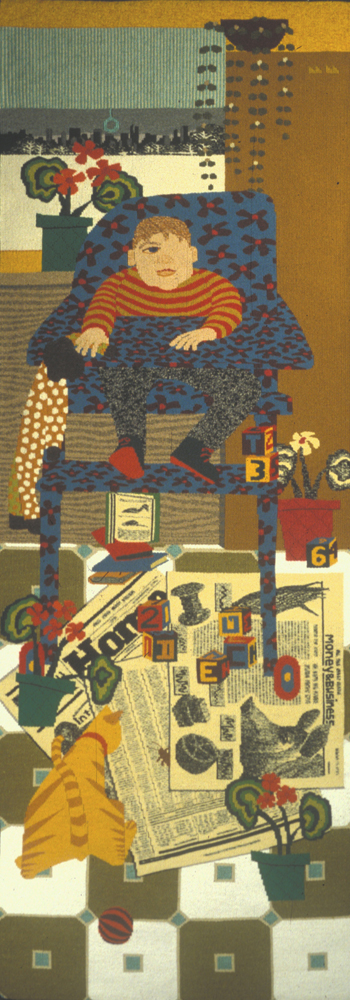
In the “New York Times“ series each tapestry focuses on one section of the Sunday New York Times and a particular person, usually a relative of Maffei. The character of the person is developed through the setting and the accompanying objects. Although she used an actual newspaper as a maquette, in “Home, Money and Business” the rest of the image was woven without a full scale cartoon. In this tapestry a jumble of toys and newspapers litters the floor where a cat eyes an unsuspecting cockroach. The profusion of pattern and the strong colors calls attention to details and individual objects, rather than developing an image with a single focus. The uniformity in the size of the floor tiles tips the plane of the room up so that it is coincident with the surface of the tapestry, but the compression and extension of the patterned motifs on the clothing and high chair cover suggests the three dimensionality of the the chair and the little boy.
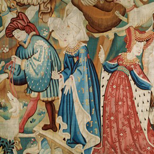
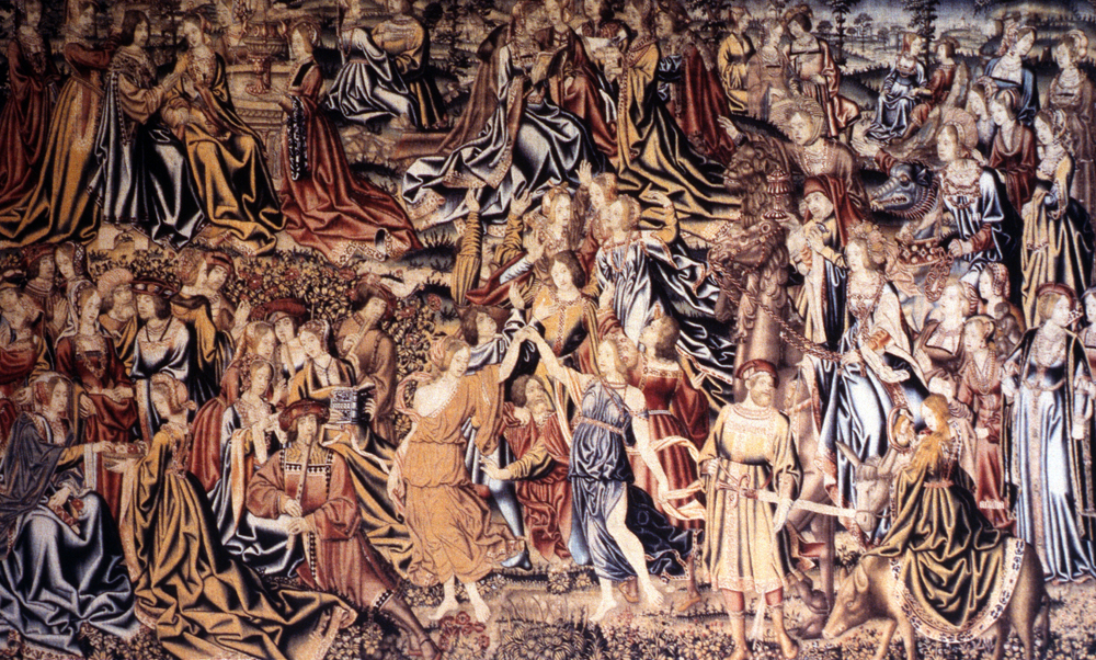
Many Medieval tapestries, such as “The Devonshire Hunting Tapestries” exhibit a similar combination, in which the shading on the clothing suggests the volume of the body but the space of the image remains relatively flat. The high horizon line, or lack of horizon altogether, the elaborate detail of the imagery, the combining of different parts of a story and the often cavalier use of scale and spatial relationships flattens the space of these gigantic panels, despite the careful rendering of folds and drapery in the clothing.
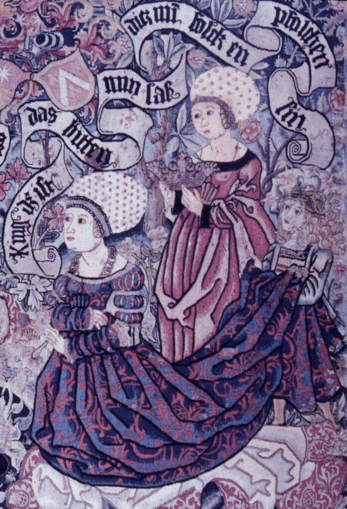
For Maffei, the suggestion of volume is not achieved through woven shading techniques, such as the complex systems of battage and hachures used in French and Flemish tapestry, but rather through the way a pattern becomes truncated around the folds in cloth, a technique which is more common in northern European tapestries such as this weaving of the “Life of Esther,” in which the folds are suggested by the interruption of the patterns in the cloth.
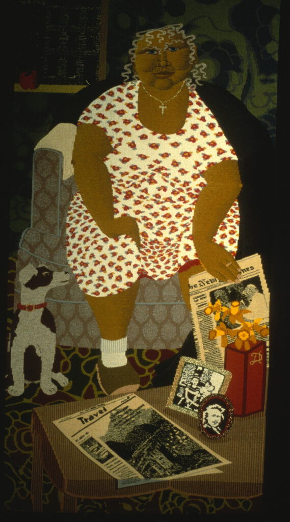
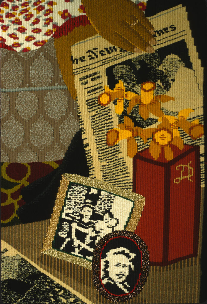
Maffei uses this approach to shading, as well as the compression and extension of a patterned motif which we saw operative in the Wari tunics, in the fabulous rendering of the woman’s dress in “Travel,” another piece from the New York Times series. The woman here is Maffei’s maternal grandmother, the person responsible for her interest in textiles. The focus on pattern and color ties Maffei’s work to Andean tapestry and her interest in narrative and the differential treatment of space is reminiscent of Medieval European tapestry.
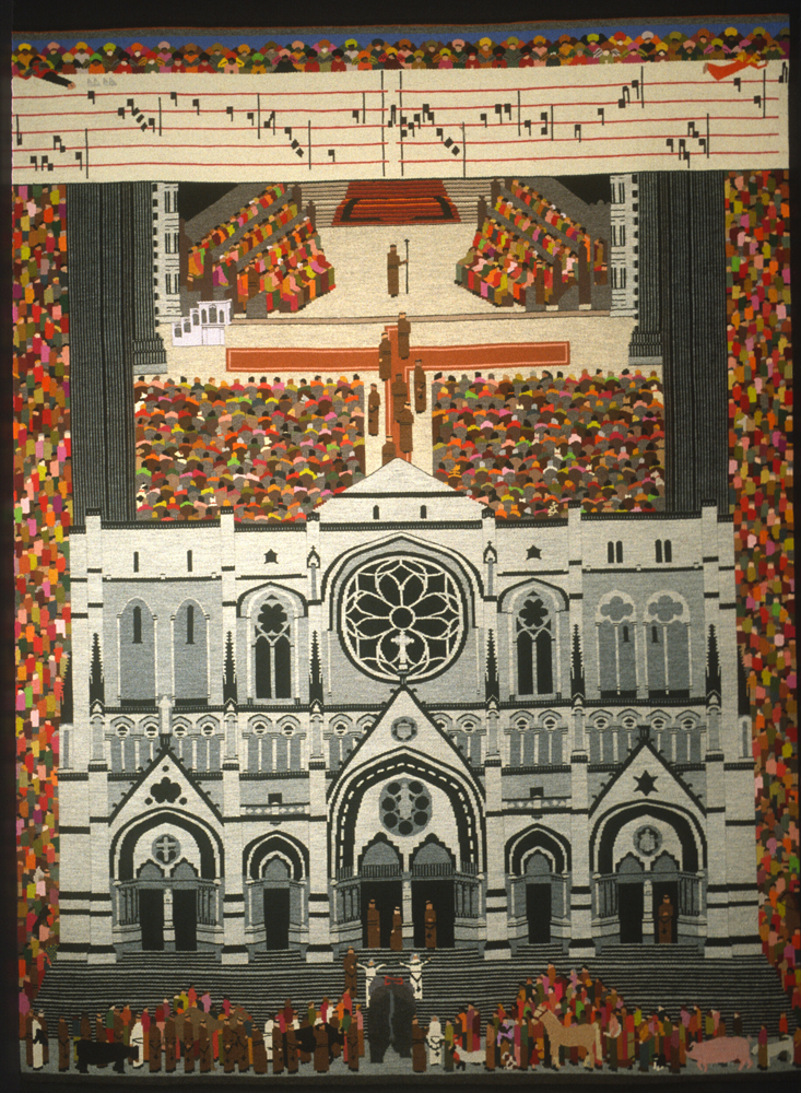
We see these different historical influences developed to an even greater narrative complexity in “Blessing of the Animals.” This tapestry depicts the annual blessing of the animals at the Cathedral of St. John the Divine in New York City on the feast day of St Francis of Assisi. Maffei’s depiction of this event, like the extended portraits of her family members in “The New York Times Series” is filtered through her experience and memory. This 79” x 57” tapestry presents a frontal view of the church with the roof removed, a perspective we saw used in the depiction of an apartment in “Two Men”. Streaming along the edges of the building are hundreds of people and pets. The crowd is a patchwork of colored shapes, a sea that dissolves into pattern, reminiscent of her earlier movie theater. The choir sings in the nave of the church and a banner of antiphonal music stretches across the top of the image, as though the voices have risen through the space of the cathedral. Maffei presents, in this tapestry, not only a sequence of spatial perspectives, but also a chronological sequence, starting with the congregation of people and pets outside the cathedral, their entry into the church, their participation in the service and the singing of the choir. Continuous narratives, in which events that occur at different times are condensed into one image are common in Medieval European tapestry and are often organized through architectural features, as Maffei does here. The combination of the incredibly dense crowd, which merges into an overall flat pattern of color and the black and white, architecturally detailed rendering of the church, shown in a frontal, cut away and bird’s eye view shows the diverse approaches that Maffei integrates into her distinctive style. Various perspectives and representational styles are combined to offer us the fullest experience of the narrative.
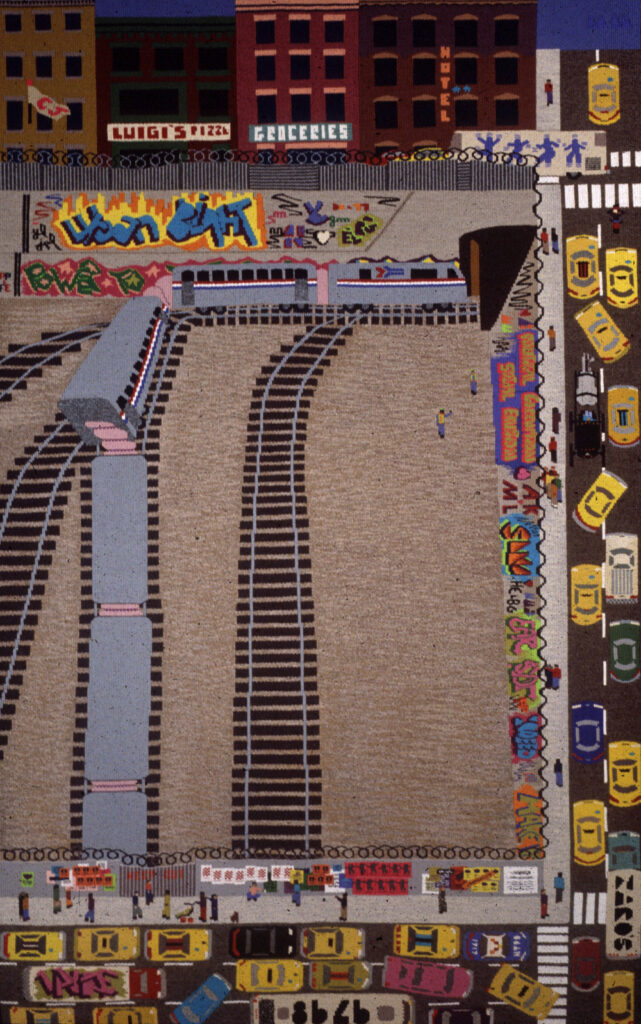
The combination of different perspectives and spatial conventions, the use of pattern and flat color, the affirmation of the flat surface of the cloth and the accumulation of narrative detail characterize all of Maffei’s recent tapestries. “Graffiti” combines an aerial view of the traffic, a frontal view of the buildings and a spatially receding view of a train careening into the station. The cars becomes a patterned, partial frame around the train yard and the buildings close off the image on the top, keeping the image, and our attention on the plane of the tapestry.
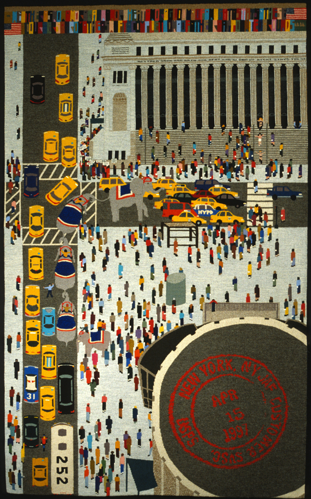
In “View from 252” we look out the window of the artist’s former apartment across 31st Street to the Post Office, where street performers and circus animals have arrived to entertain last minute tax filers on April 15th. Here again, we see the central image bounded asymmetrically by the pattern of traffic and the Post Office logo , a combination of viewing perspectives and the rendering of a witnessed experience in minute detail.
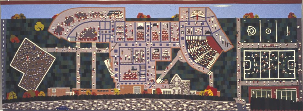
In 2000 Maffei was approached about weaving a commission for the Roland Park Country School in Baltimore. Although she does not usually work on a commission basis, the patron convinced her to pursue the project by allowing her to define the size and design of the tapestry in a way that fit with her own artistic vision and working methods. Maffei spent a considerable amount of time at the school, watching the girls study and play. The result was a 64” x 168” tapestry that, like the New York Times series, is a portrait, this time of a school and the artist’s memory of her experiences at the school. Maffei’s style is easily recognizable – the mixture of different viewing perspectives, the accumulation of a vast amount of narrative detail, the high horizon line, the use of pattern and the attention to two viewing distances – the further distance, at which the image becomes a broad composition of different areas, each a mosaic of pattern and color and the closer distance, where one sees the individual details of children playing ball and studying in the classroom. Although we can see the development in complexity in Maffei’s way of designing and weaving build from the smaller, earlier portraits to pieces such as the movie theater and the New York Times series, the long, horizontal format of this particular piece was a new challenge. Maffei developed her ability to work without a full scale cartoon by starting with small images and then moving to images whose dimensions were more vertical. Narrower images would require her to manage fewer elements across the width of the piece at one time. A vertical format also reflected her interest in thinking of the development of the image, or narrative, in tandem with the development of the weaving. Developing an image across a 14’ expanse, on the other hand, requires the ability to manage and unify many more elements at one time. In the Roland Park tapestry, and even in “The Blessing of the Animals”, “View from 252” and “Graffiti,” the development of the narrative occurs both horizontally and vertically, following more closely the model of the continuous narratives so common in historic European tapestry. The story is fleshed out by joining together many parts or events which may not have been synchronous or even located in the same space. Within the broader narrative structure we see the influences of Andean tapestry – strong color contrast, distilled forms that are rooted firmly in the geometric grid of the warp and weft and the interest in pattern and motif repetition. We also see the narrative and decorative detail so characteristic of European tapestries.
Throughout this paper we have come to recognize the attributes that characterize Maffei’s tapestries – the use of pattern and flat, bright colors, the mixing of different spatial conventions and the development of narrative detail. We have also seen that her unique style reflects an interest in integrating the structural qualities of tapestry, the weaving process and the image into a conceptual unity. Her study, and admiration of historic tapestries has been a significant influence, but it is the way that she had assimilated their lessons into her thinking process, and then applied those principles to a subject matter that reflects her own interests and her own culture, that makes her work stand out. She has identified what she considers to be the features that make the earlier works so incredibly powerful and harnessed those powers to her own vision.
End Notes
1. Pierre Bordieu, Outline of a Theory of Practice, Cambridge: Cambridge University press, 1977 in Franquemont, Ed “The True Treasures of Andean textiles” in Traditional Textiles of the Andes: Life and Cloth in the Highlands, ed. Lynn Meisch Thames and Hudson: London 1997 pg 31.
2. Stone Miller, Rebecca . Art of the Andes: From Chavin to Inca Thames and Hudson: London 2002.
3. Artist Statement.
4. Artist Statement.
