Several people have asked how I developed the design for my most recent tapestry, Wander. I’ll make a stab at explaining it here.
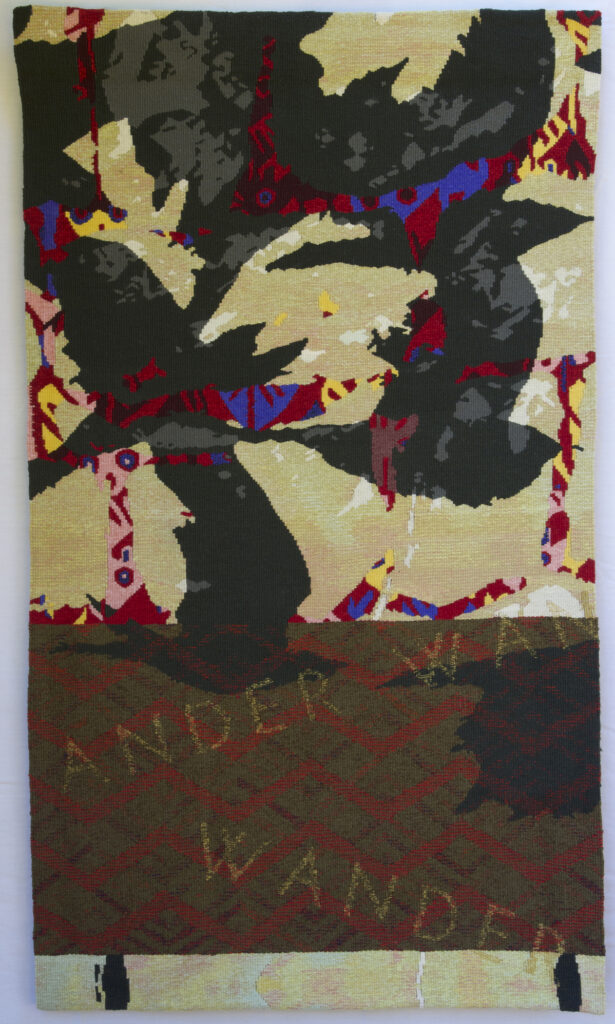
My most recent work (see Boundless and the Reconsider series here) references historical textiles through the incorporation of borrowed patterns, motifs and/or details from actual historical tapestries. The textile excerpts are combined with each other, and with other image sources, such as drawings or photographs, to produce a layered image in which the different components are merged together into one blended image.
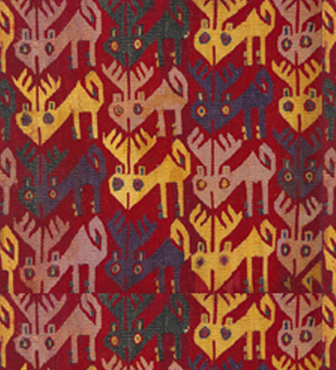
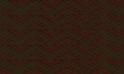
Wander combines details from an Andean textile showing a pattern of Brockett deer, a photograph of rocks, a drawing of birds in flight and a pattern from a Berber carpet. The diagonals in the rug pattern and the flying birds suggested the title Wander, which I incorporated as text into the tapestry.
The design is collaged, layered and blended in Photoshop. It went through 27 different morphs along the path to its resolution. The final version has 14 layers.
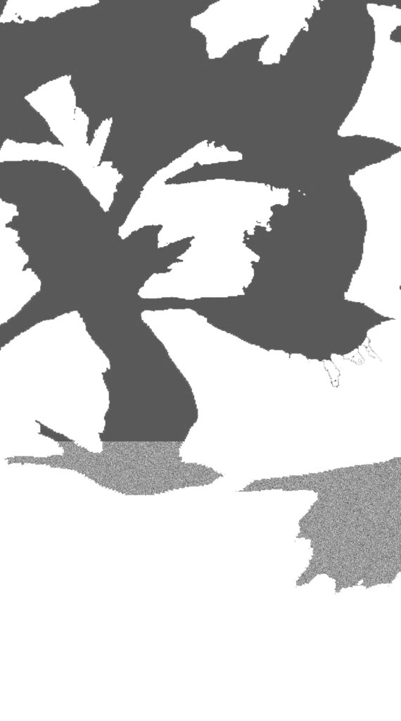
One layer is an Andean tapestry depicting a pattern of Brockett deer. Two layers are themselves collages of different parts of a drawing of flying crows.
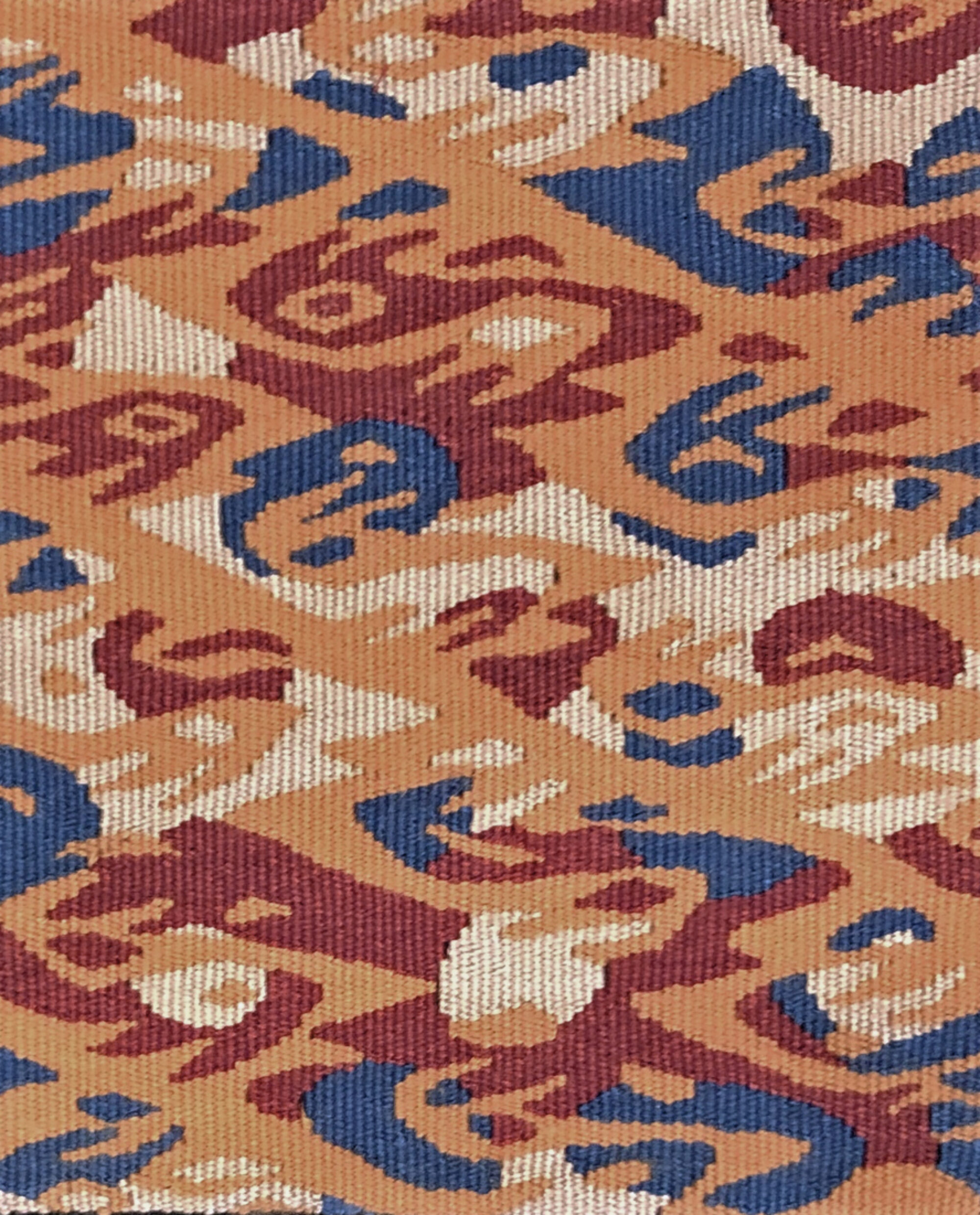
Five layers are a detail from a Berber carpet repeated. Two of the layers are the text in the image.

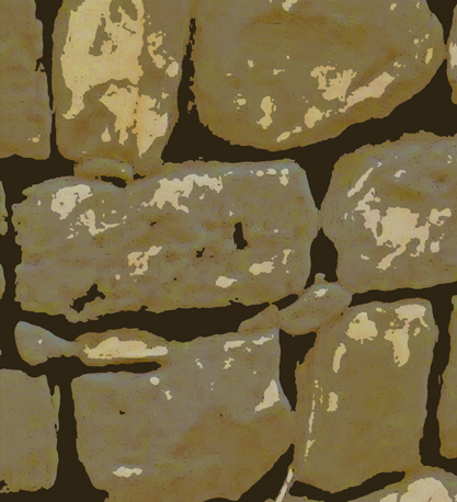
One layer is the rock layer. The rock layer is a crop from a rock wall which I then altered with the Cutout Filter in Photoshop. Two layers make up the bottom section of the tapestry. They are a crop from the rock layer repeated – first right side up and then upside down.

The last layer is the background, which is a dark grey.
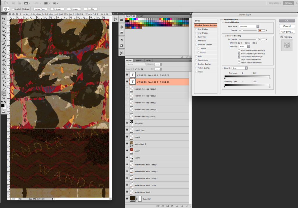
I used the Blend If and Dissolve functions in Photoshop to merge the different layers together. Dissolve bleeds images into one another. You can control the degree to which they bleed but the bleed is the same across the entire image. That works well for certain situations. For example, I used the Dissolve function to merge the text into the Berber carpet. The Blend If function allows for a more sophisticated merging of images. You can control the amount that the top layer bleeds into the bottom layer (or the bottom layer bleeds into the top layer) at different points along the value scale. So, for example, the Brockett deer tapestry bleeds through the rock layer only in the darkest value. Positioning the layers with respect to each other is critical in controlling which layer bleeds through to another. The possibilities are mind boggling and that is why I had 27 renditions of the image. I usualy find it is very hard to decide that an image is finished.
Another reason I had so many versions of this design is that I took Gerhardt Knodel’s class, Mining Historic Textiles as a Route to the Future, when I was working on this design. You can read about my experience in that class on Ellen Ramsey’s blog. Before the class, the design was just the section above the Berber carpet. Gerhardt talked about creating disruptions in designs and it was that thought that inspired me to work more on this design, adding the carpet pattern, text, and repeated section on the bottom.
Just in case you are interested, this is what the interface looks like for one of the text layers of this particular design.
I enjoyed weaving this tapestry. It was scaled well for the size, 53″ x 30,” and warp sett, 8 ends per inch. There was a lot of “noise” in the image – little dots of color. I like to strike a balance between blended colors (different colors in the weft bundle) and colors that are solid. Because the colors in the background and the section with the Berber carpet were quite variegated, I made the colors of the birds and the Brockett deer tapestry flatter than they were in the design. I used hachures and battage to blend the colors in the background and to create the patterns in the Berber carpet.
I am working on several more designs using this design process and I look forward to finishing one for my next tapestry.
Thanks for these details Mary. It is fun to understand better how you approached this design. The tapestry is wonderful and I really hope I can see it in person one day.